Shihab Brand Designer

Shihab

I’m Shihab, a 17-year-old independent brand designer based in Singapore. I started designing at 9, growing up in a family of artists where creativity was always part of life. I guess you could say it runs in my blood. At 12, I discovered brand design, and I’ve been hooked ever since.

Along the way, I’ve had the chance to work with YC-backed startups, unicorns, and top-tier creative agencies around the world. I’m always experimenting, exploring new ideas, and pushing my work further. I also back early-stage startups, and have invested in a few. And when I’m not designing, you’ll probably find me playing FIFA.

I also love exploring different AI and tools, and incorporating them into my everyday life. Whether it’s experimenting with new tools or finding different ways to use them in my work, I’m always curious about what’s possible. Honestly, AI has made my life a lot easier than it used to be. I know some people are afraid that AI is taking over, but I don’t see it that way. I believe AI is a tool that makes us more capable, not less creative. It’s all about how you use it, and I see it as an opportunity to push my ideas further, experiment more, and do things I couldn’t have done before.

Always up for a chat. Reach me on X, Telegram, or email .

fig 01 — Mimo: an AI code reviewer Brand Design
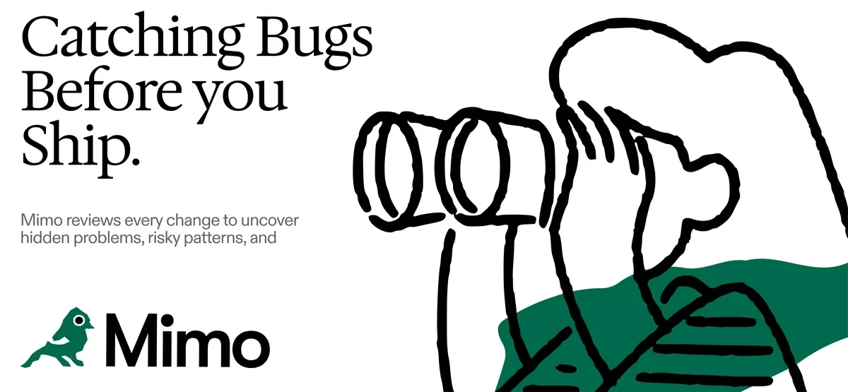
Catching Bugs Before you Ship, beside a hand-drawn figure looking through oversized binoculars, with the green Mimo bird logo.
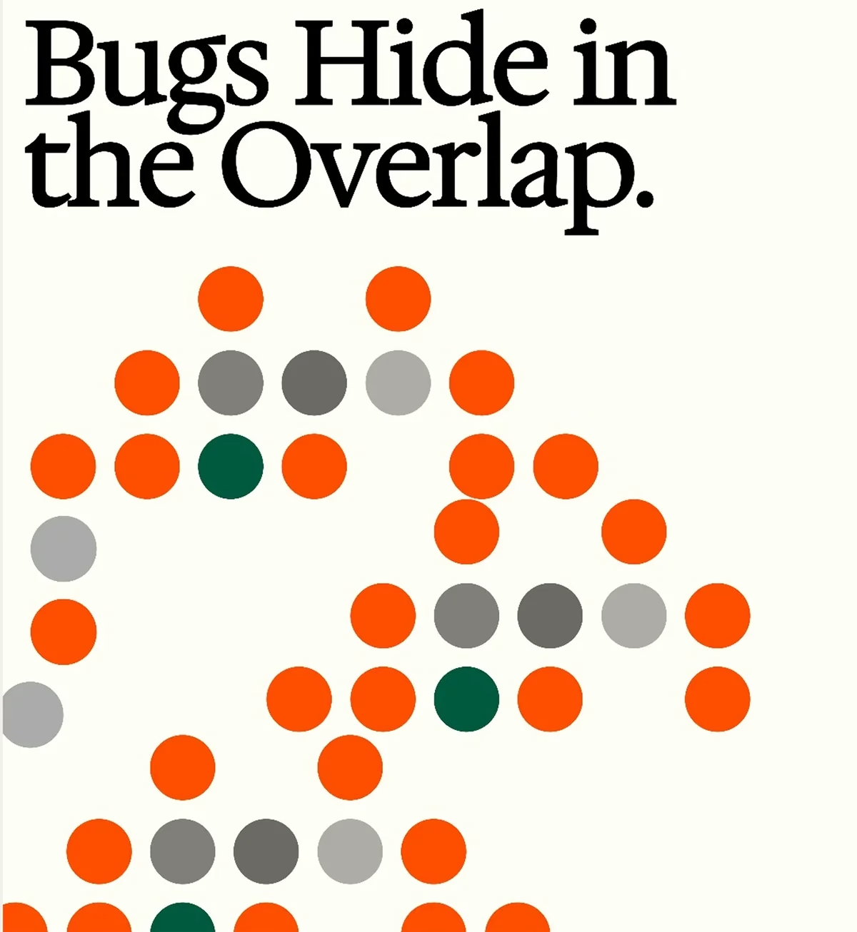
Bugs Hide in the Overlap, above a field of orange, grey and green dots arranged in loose clusters.
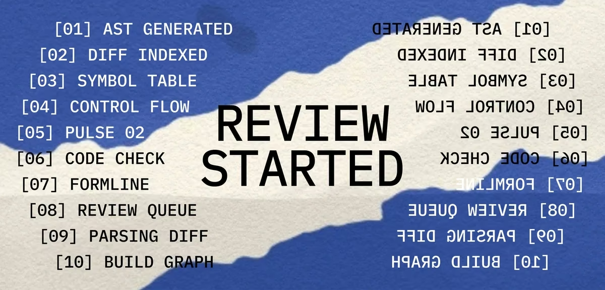
Torn blue and cream paper reading REVIEW STARTED, flanked by a mirrored numbered list of review stages.
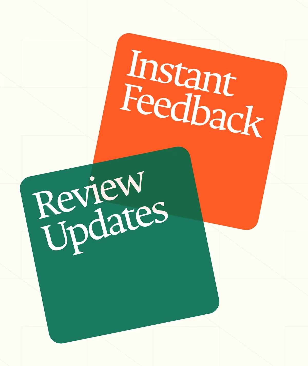
Two overlapping rounded cards, orange reading Instant Feedback and green reading Review Updates.
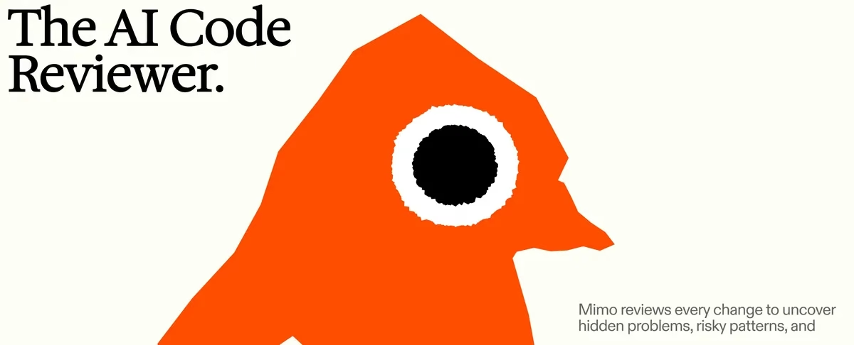
The AI Code Reviewer, beside a large orange geometric bird head with a single black eye.
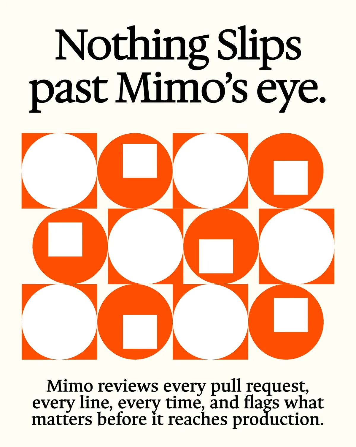
Nothing Slips past Mimo's eye, above a grid of orange circles and squares interlocking.
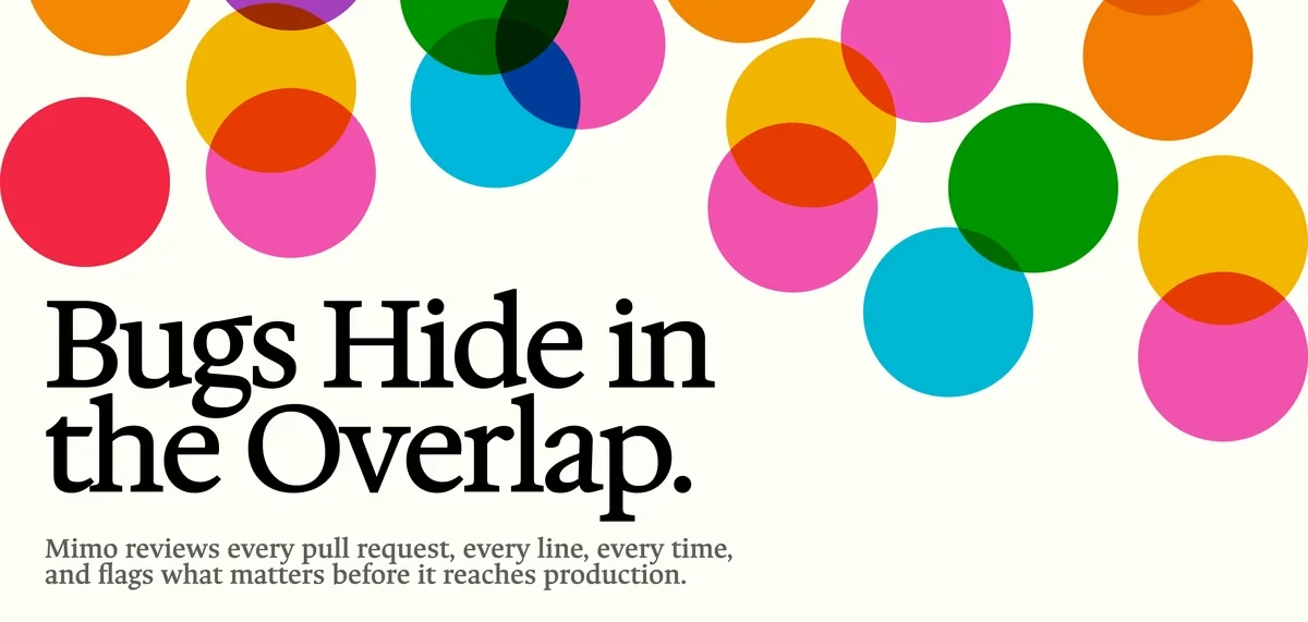
Bugs Hide in the Overlap, with overlapping translucent circles in pink, orange, green and blue above the headline.
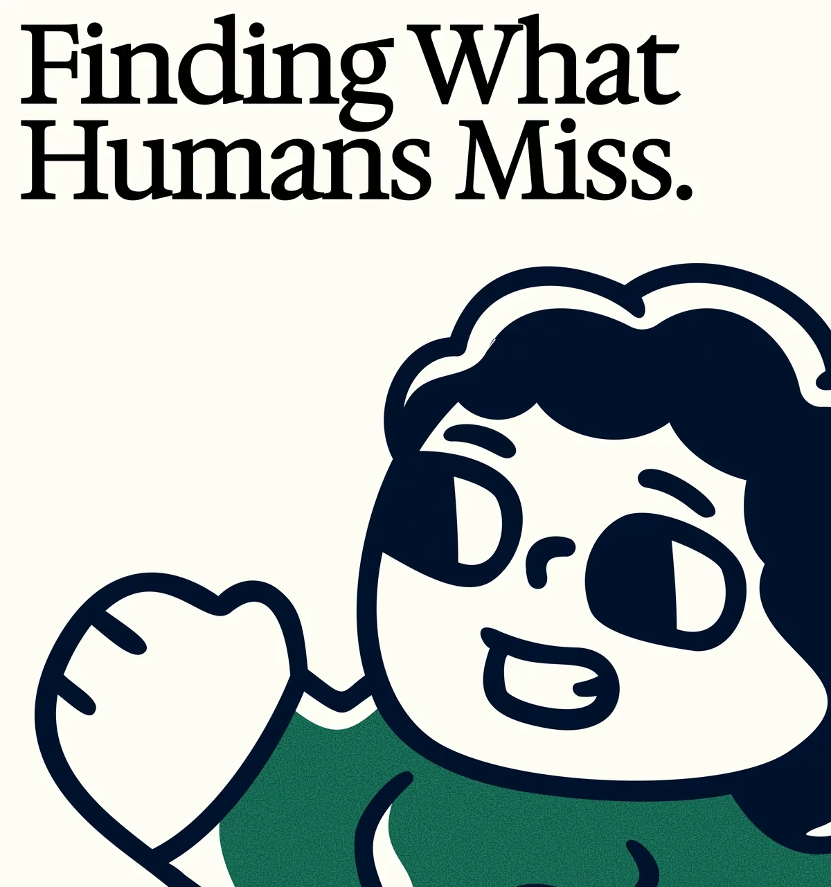
Finding What Humans Miss, above a navy and green hand-drawn character waving.
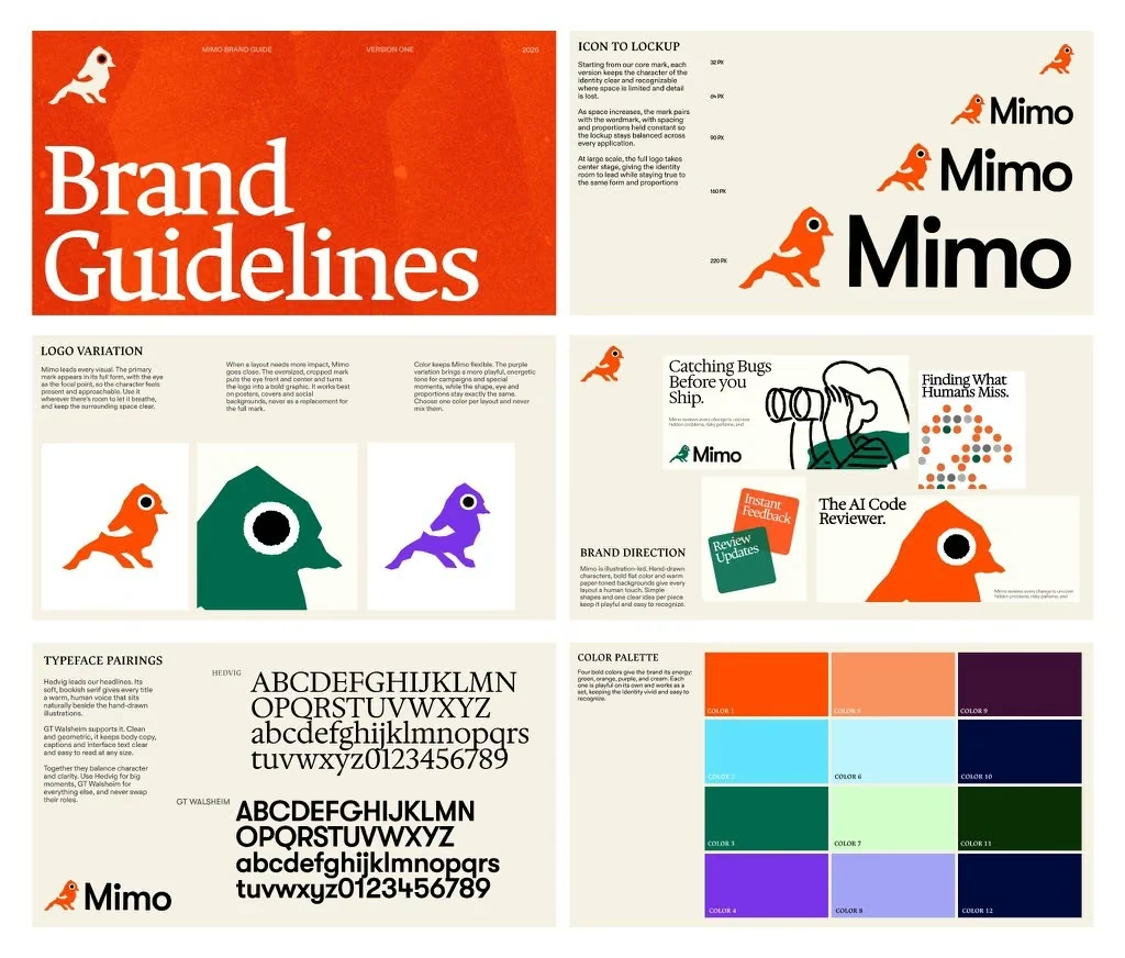
The Mimo brand guidelines spread: logo lockups, logo variations, brand direction, typeface pairings and the twelve-colour palette.
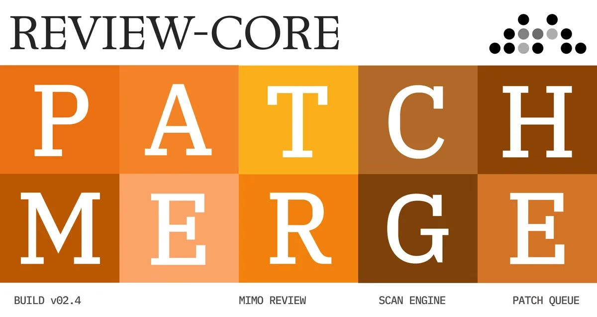
REVIEW-CORE: the words PATCH MERGE set across a grid of orange and brown tiles, with build and scan engine labels beneath.
fig 02 — Bictor: a training ground for AI models Brand Design
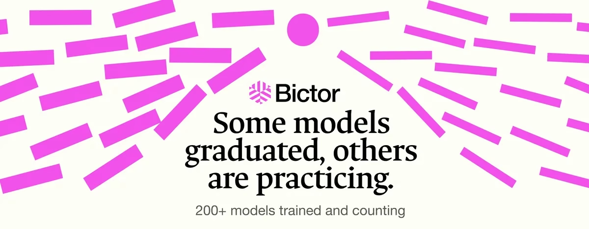
Magenta shards radiating outward from the Bictor wordmark, with the line Some models graduated, others are practicing.
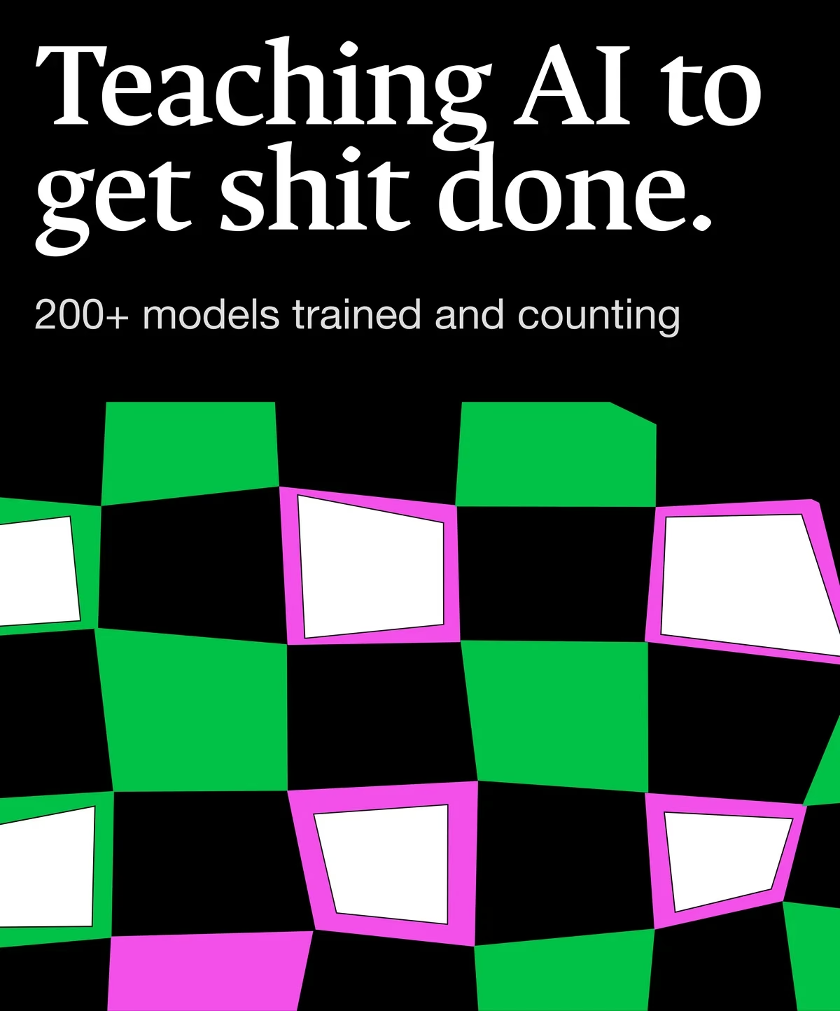
Black poster reading Teaching AI to get shit done, over a warped green, magenta and white checkerboard.
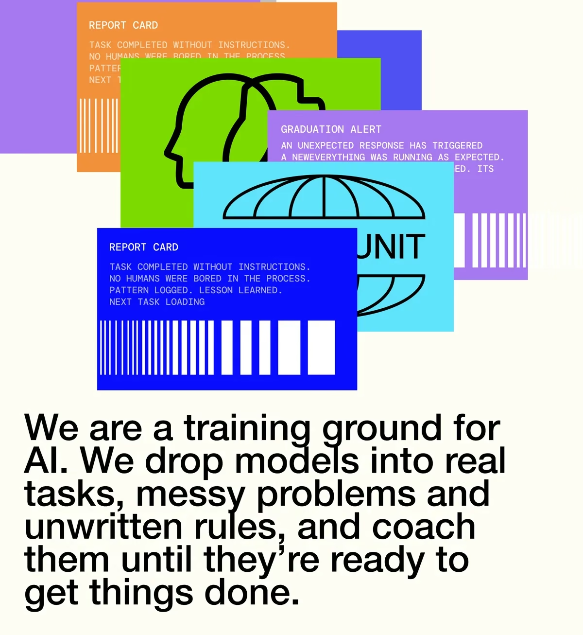
Stacked report cards in orange, green, blue and purple, above the line We are a training ground for AI.
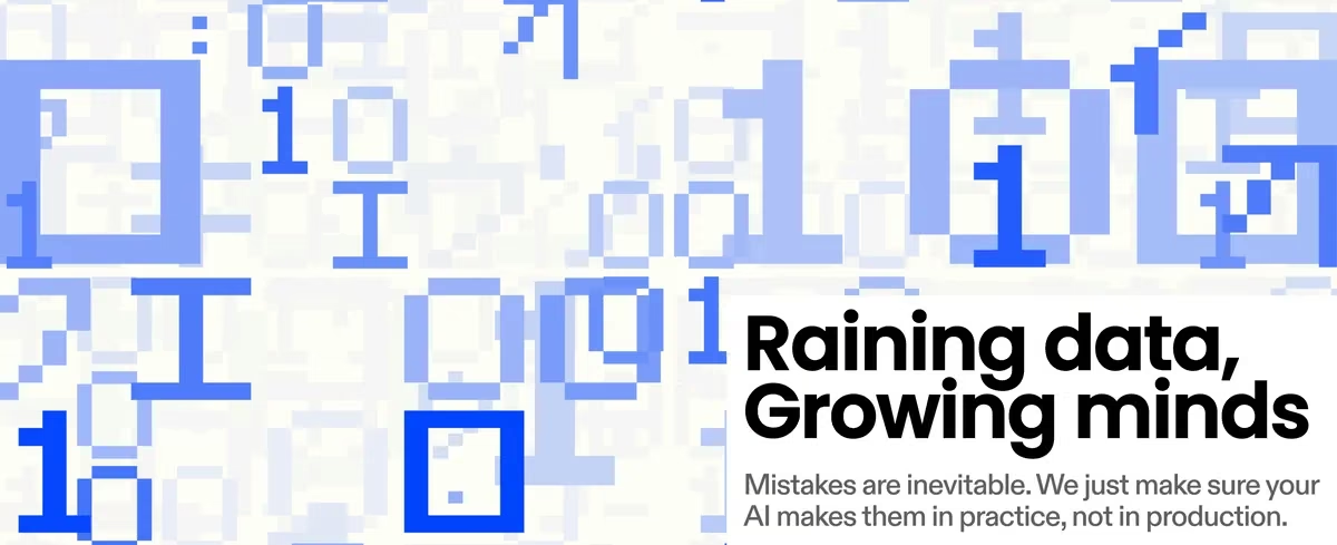
Pixelated blue ones and zeroes beside the headline Raining data, Growing minds.
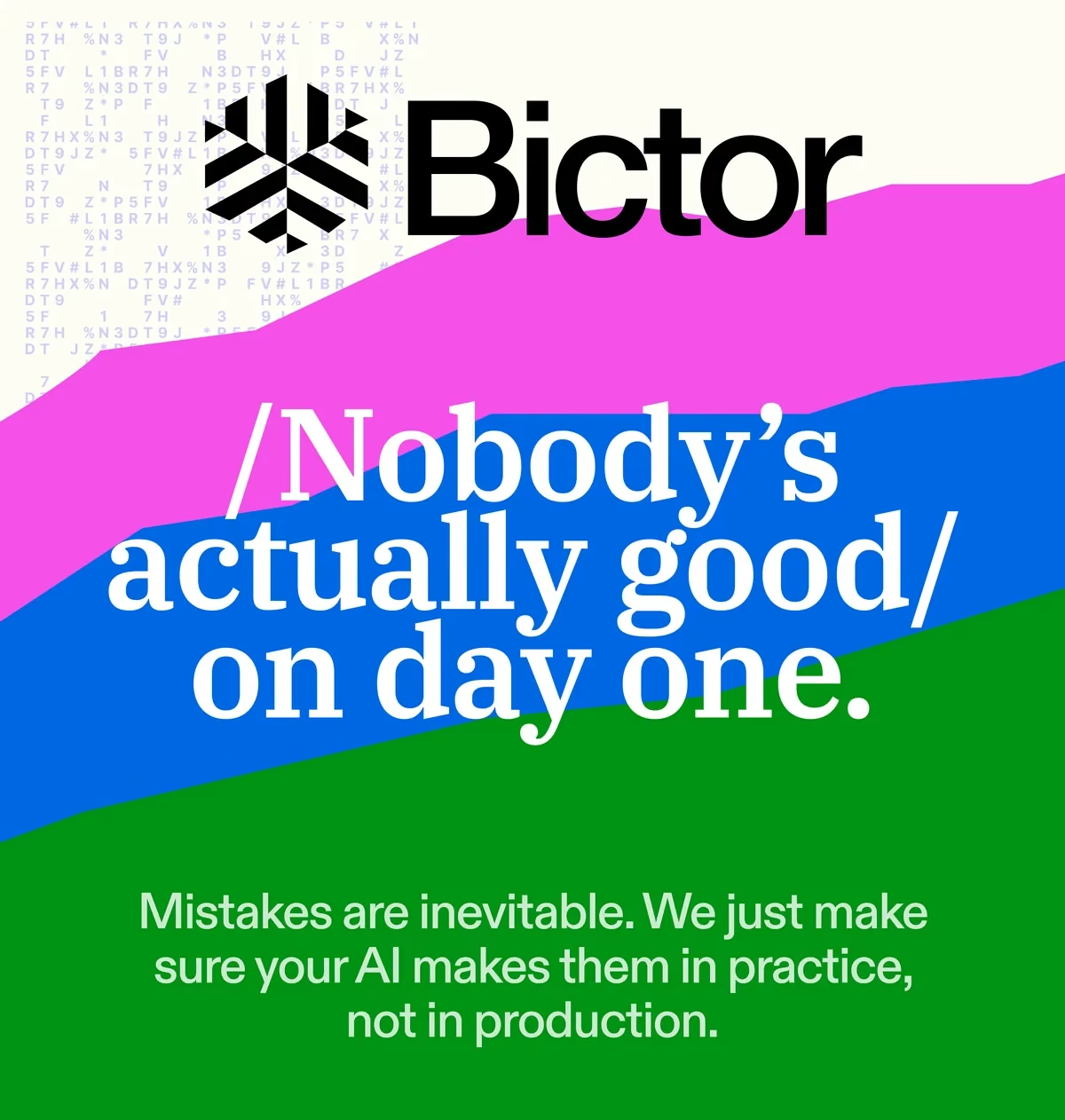
The Bictor mark above sweeping pink, blue and green bands and the line Nobody's actually good on day one.
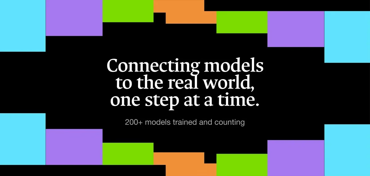
Black banner framed by cyan, purple, green and orange blocks, reading Connecting models to the real world, one step at a time.
The Bictor logo on white: a magenta hexagonal snowflake mark beside the wordmark.
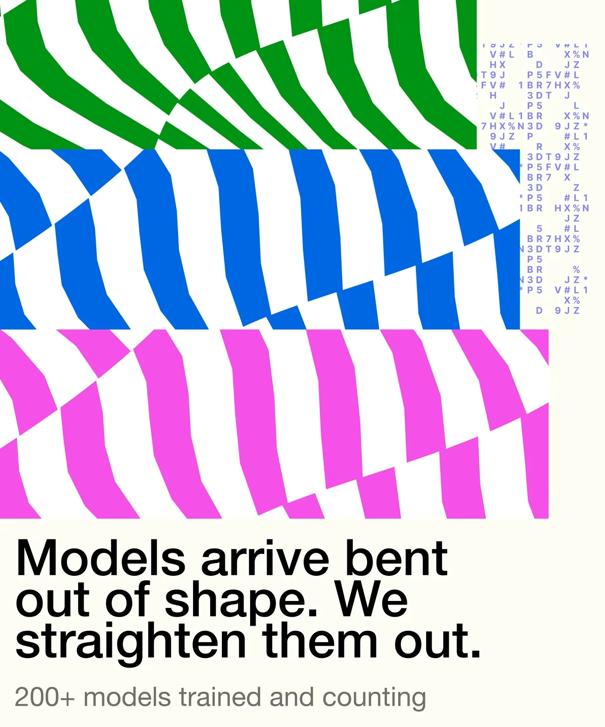
Warped green, blue and magenta stripes above the line Models arrive bent out of shape. We straighten them out.
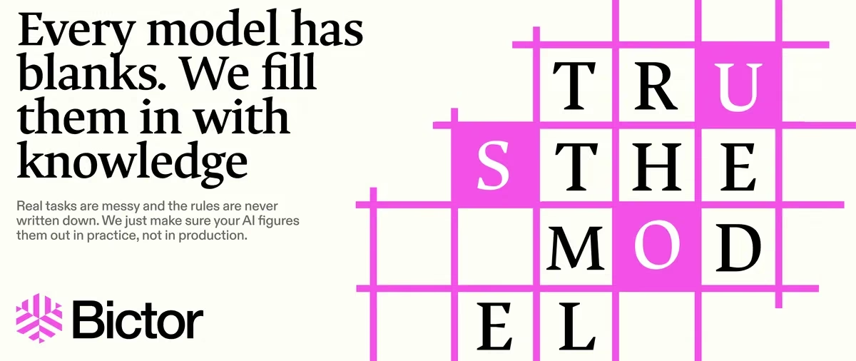
Every model has blanks, we fill them in with knowledge, beside a magenta crossword grid spelling TRUST THE MODEL.
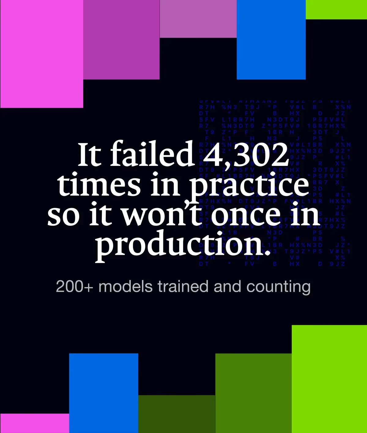
Dark poster with colour blocks reading It failed 4,302 times in practice so it won't once in production.
fig 03 — Lucid AI: open knowledge for history Brand Design
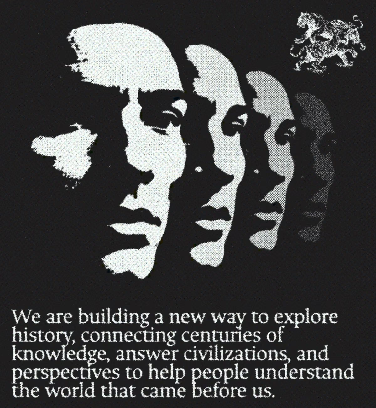
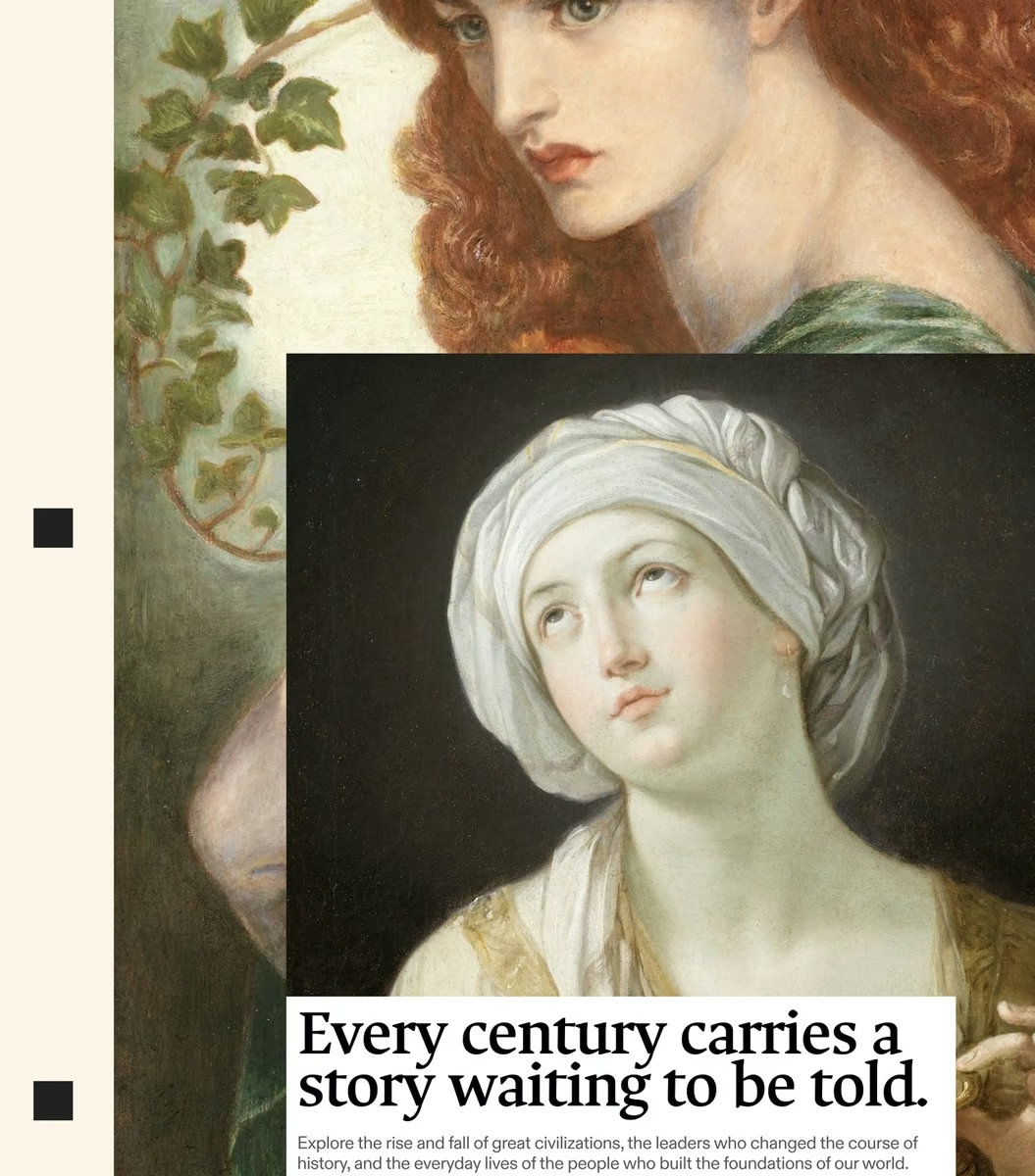
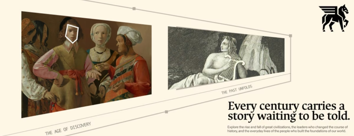
Three stencilled faces in halftone over a dark ground, with the mission statement set beneath in a serif face.
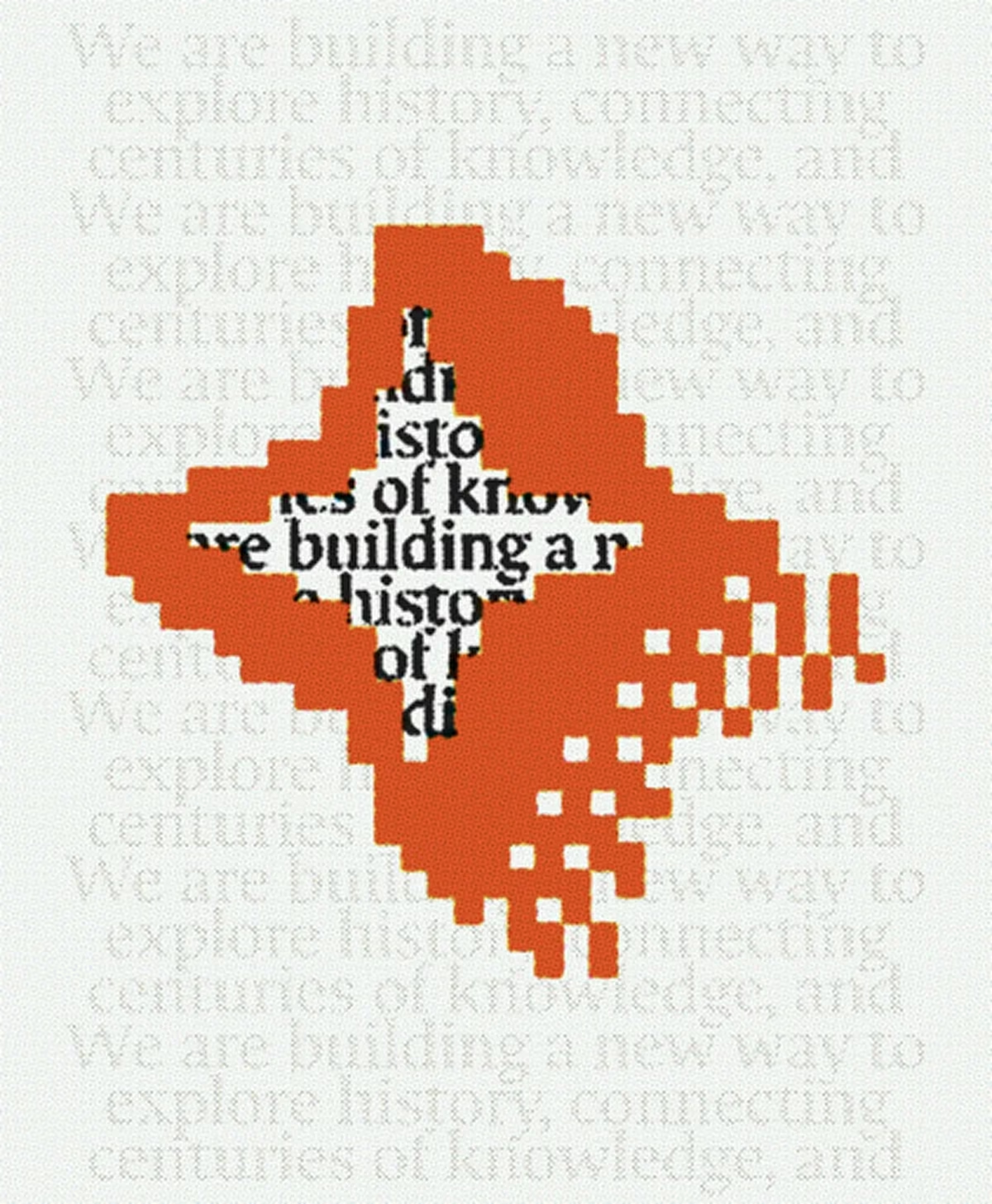
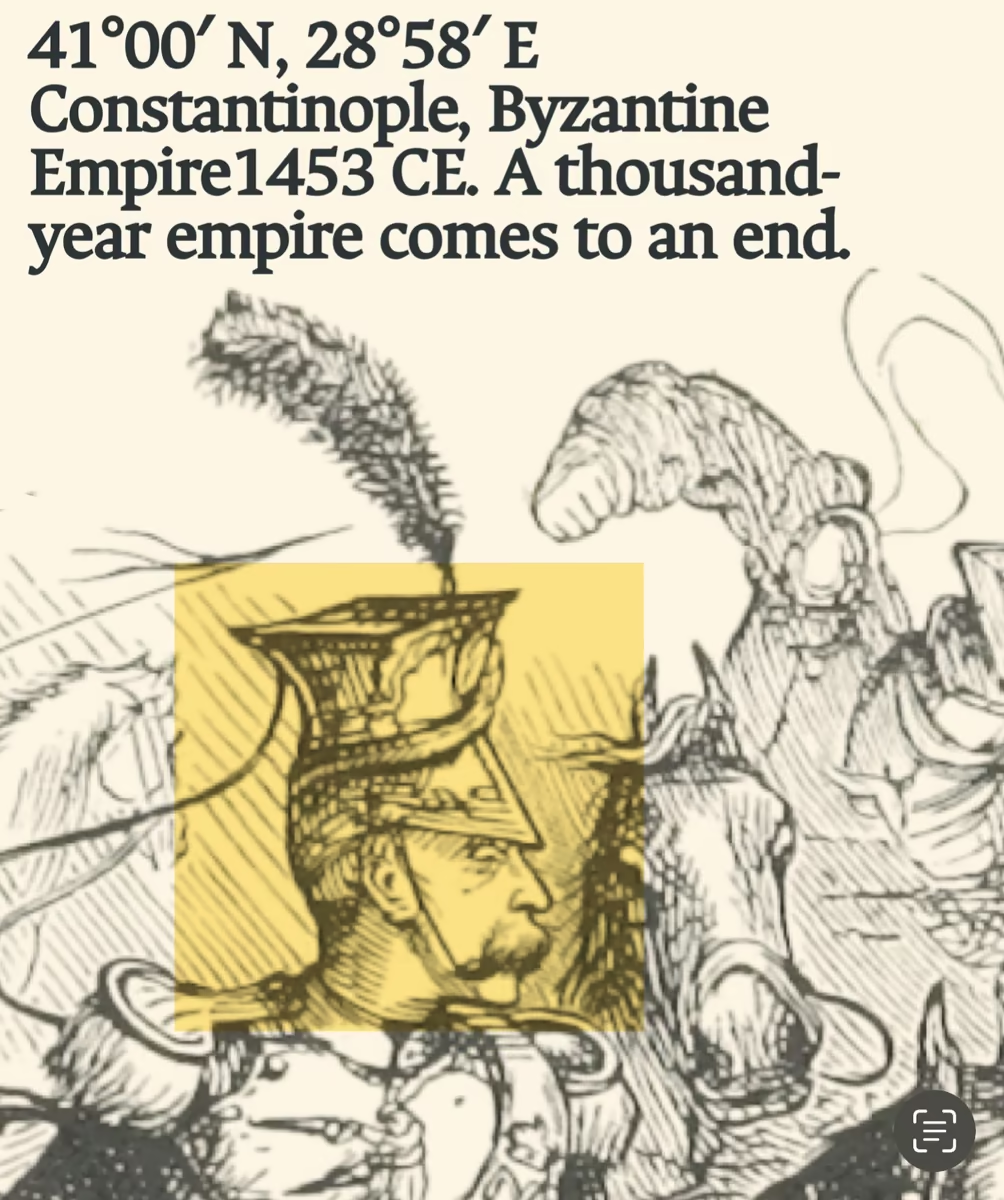
A pixelated orange burst breaking through repeated ghosted lines of the mission statement.
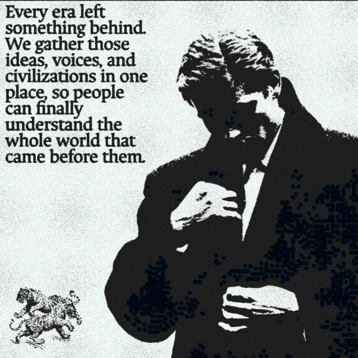
High-contrast halftone portrait of a seated figure with the positioning copy set alongside it.
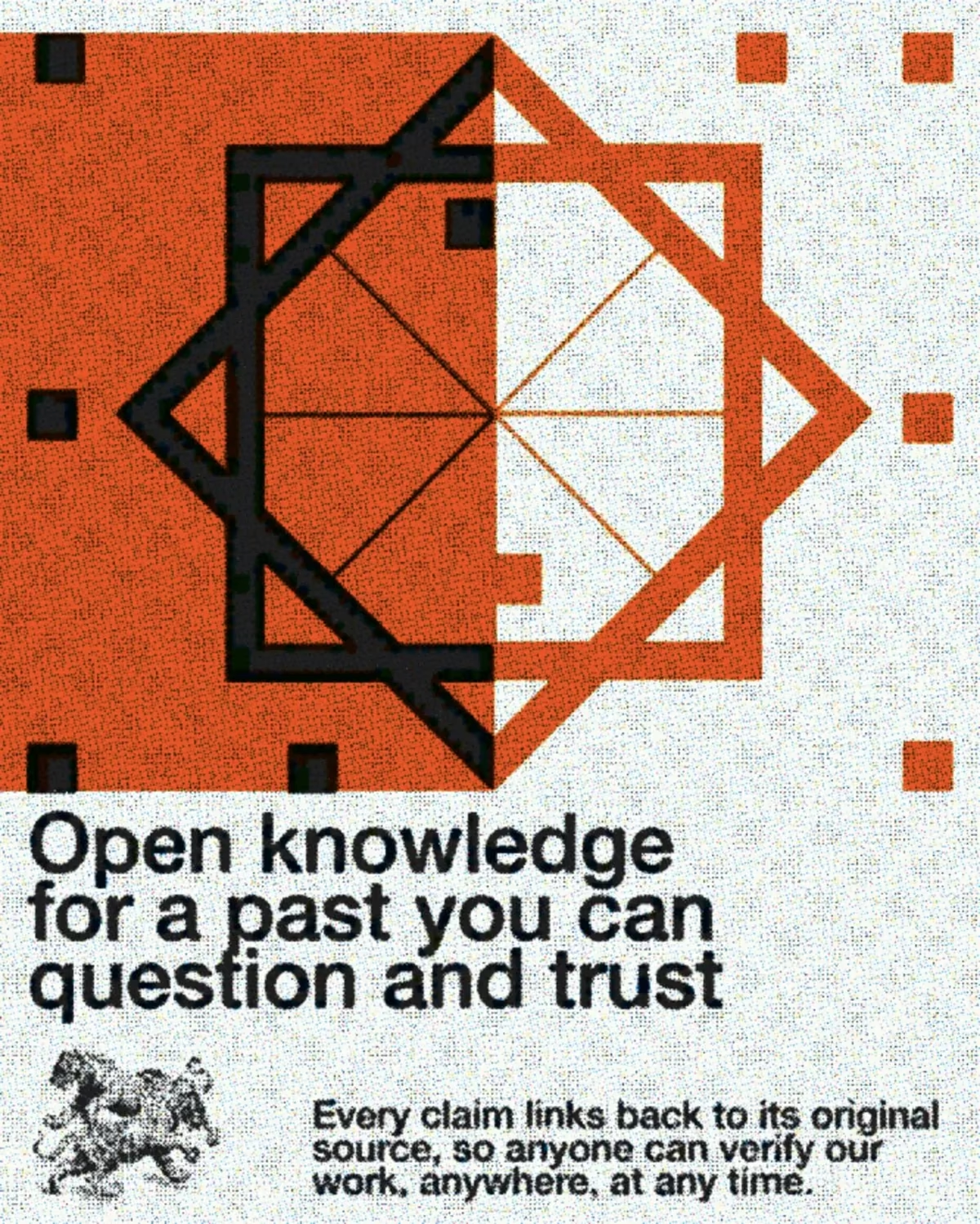
Orange and black geometric mark built from rotated squares, above the line Open knowledge for a past you can question and trust.
The Lucid AI wordmark in black beside a pixelated orange four-point star that dissolves into scattered squares.
fig 04 — Forge Legal: legal AI with traceable sources Brand Design
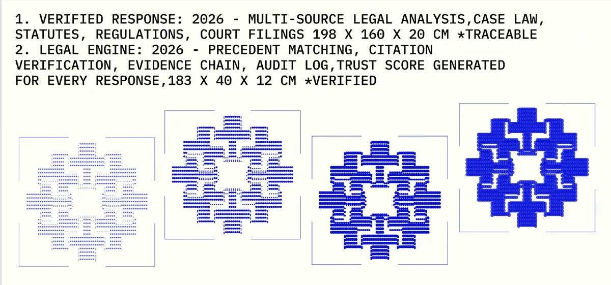
Monospace spec text above four blue pixel-snowflake marks, each denser than the last, in thin bracket frames.
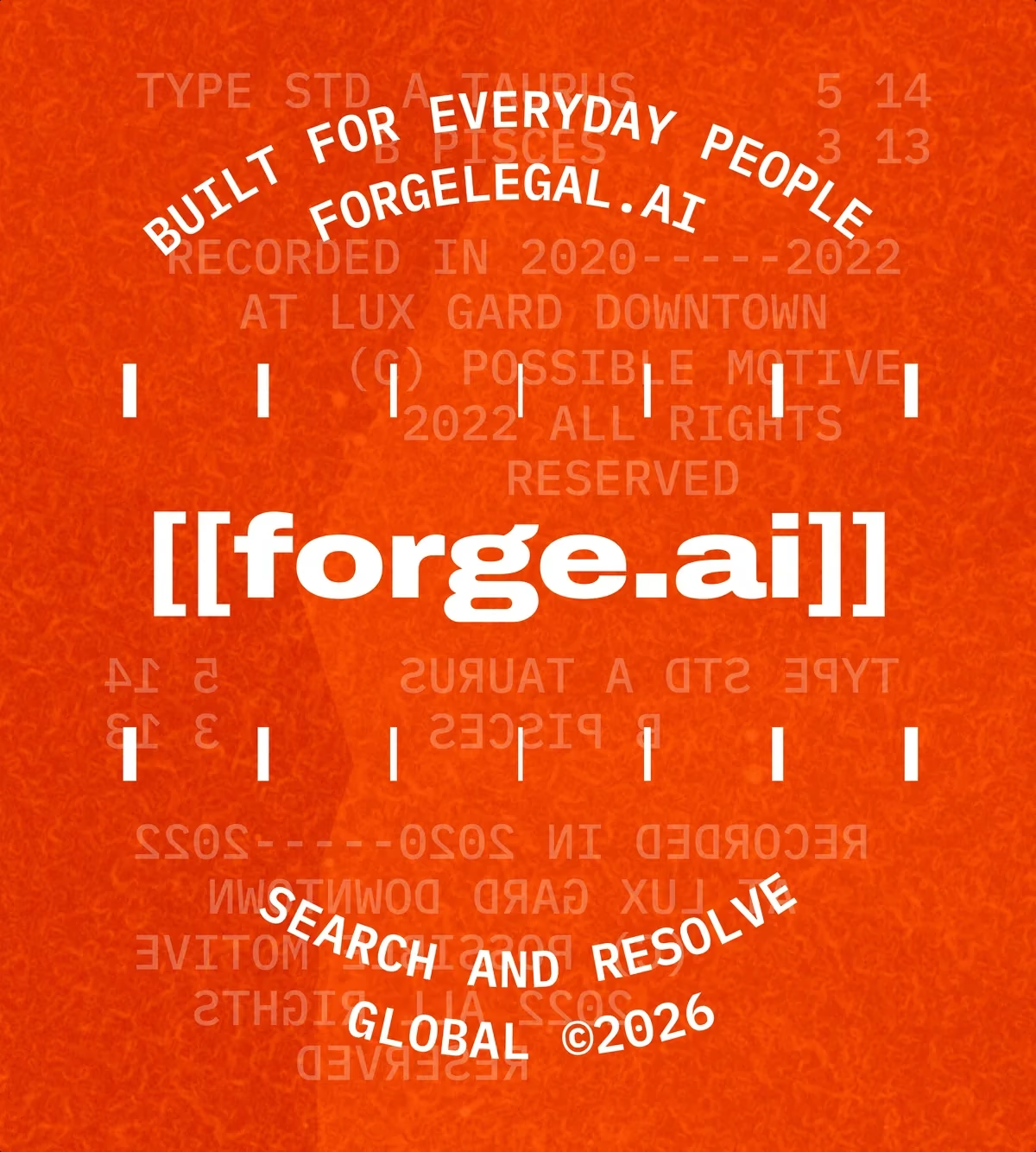
Orange textured badge: [[forge.ai]] ringed by BUILT FOR EVERYDAY PEOPLE, FORGELEGAL.AI and SEARCH AND RESOLVE.
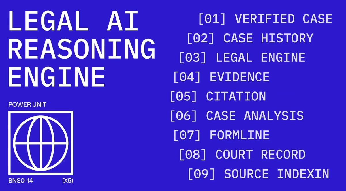
Blue banner reading LEGAL AI REASONING ENGINE beside a numbered list from verified case to source indexing.
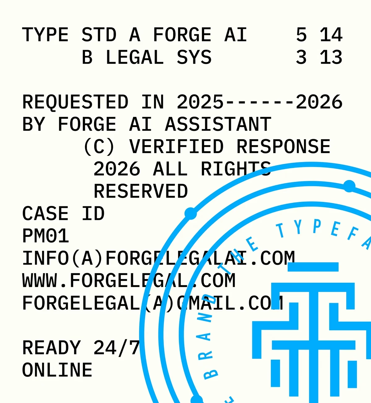
Cream poster of monospace spec text and contact details, overlaid with a blue circular brand stamp and the pillar mark.
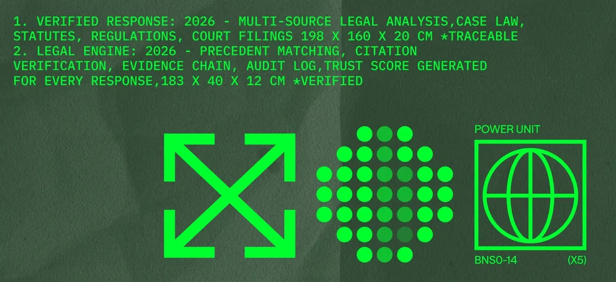
Dark green banner of spec text with a green expand arrow, dot cluster and globe power-unit mark.
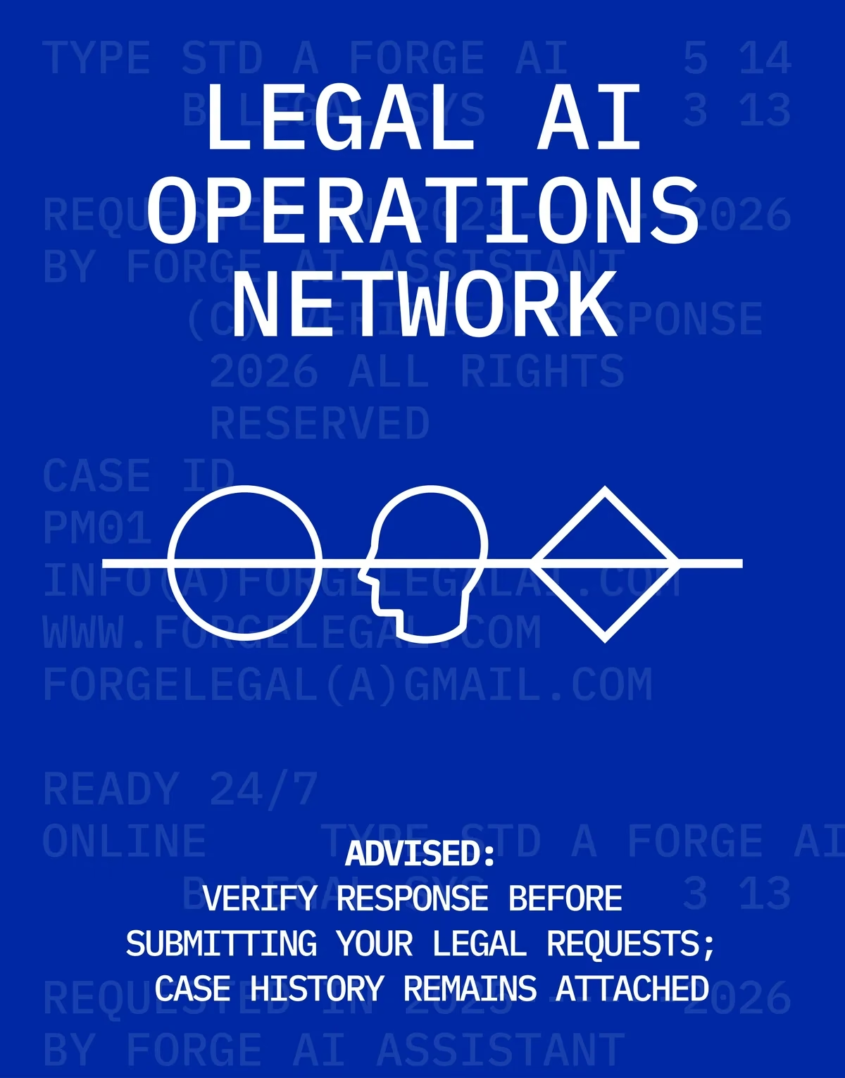
Deep blue poster reading LEGAL AI OPERATIONS NETWORK, with circle, head and diamond icons on a horizon line.
Green type on dark green: EVIDENCE, FORENSIC, CASEWORK and VALIDATE framing two overlapping head outlines.
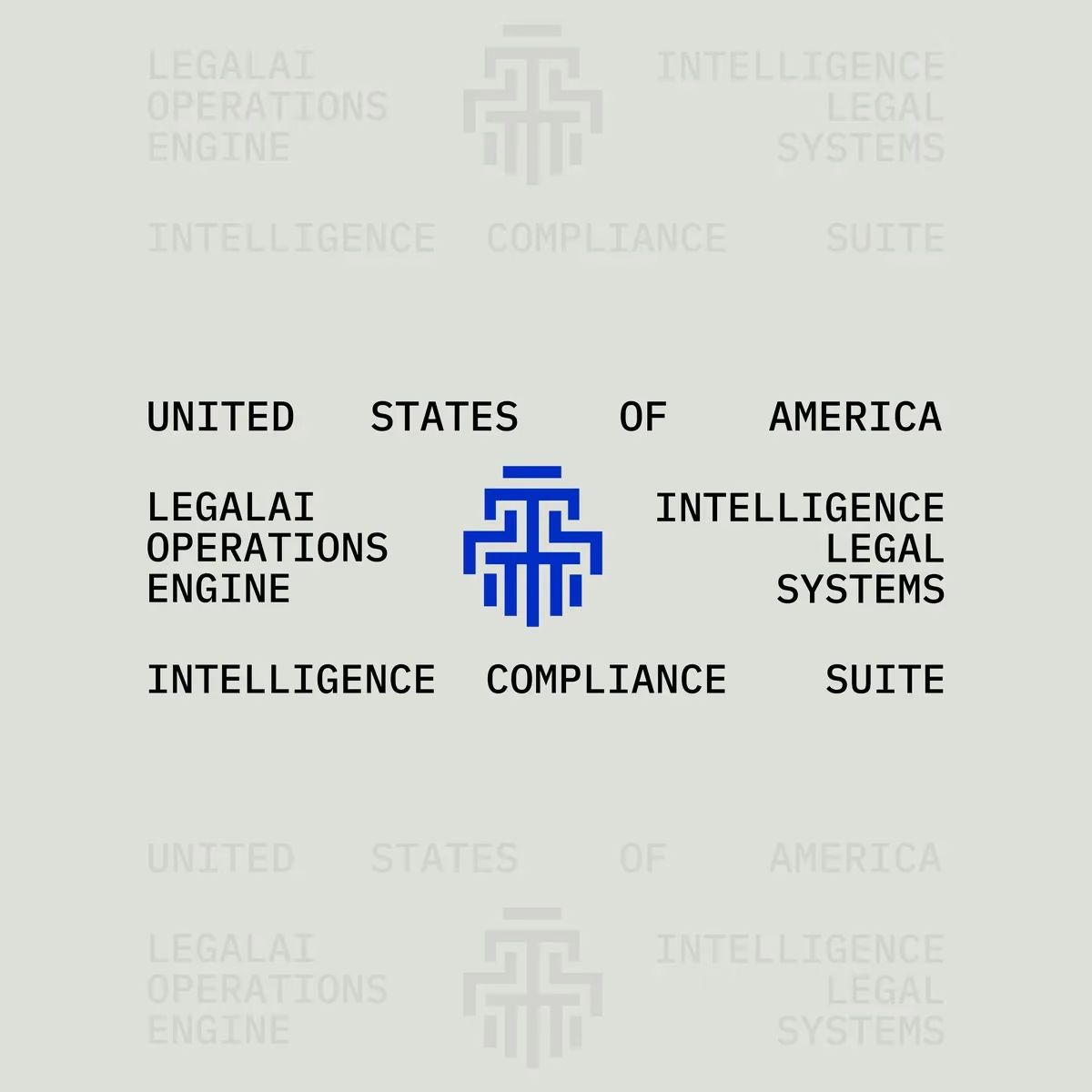
Grey layout with the blue pillar mark centred between LEGALAI OPERATIONS ENGINE and INTELLIGENCE LEGAL SYSTEMS.
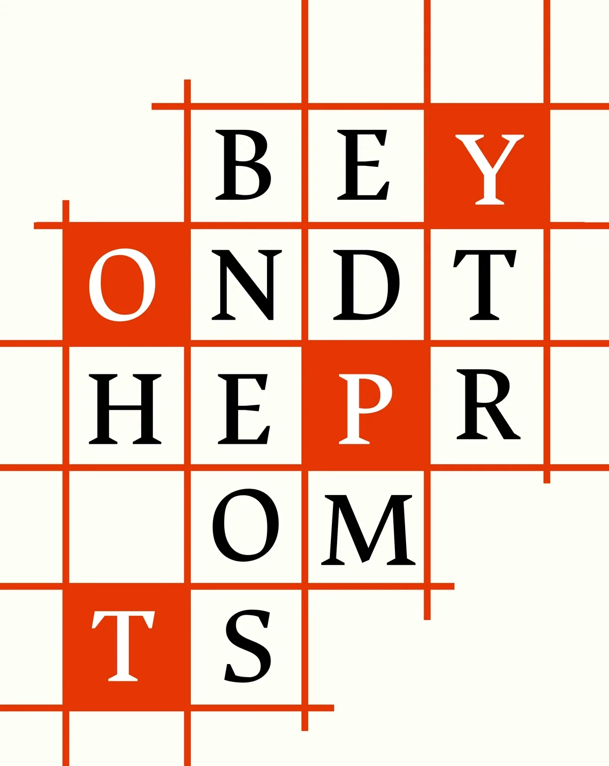
Red and cream crossword grid spelling BEYOND THE PROMPTS in a high-contrast serif.
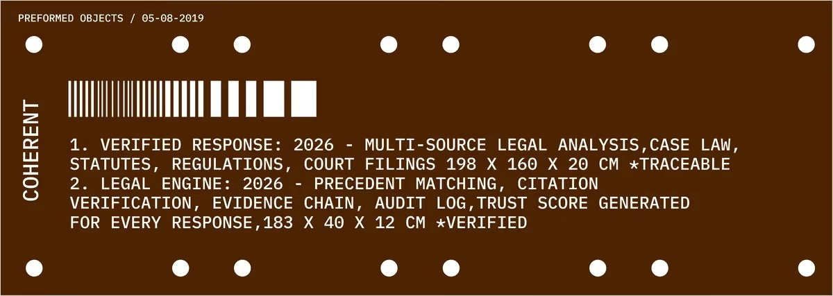
Brown banner labelled COHERENT with a barcode and the verified-response spec text.
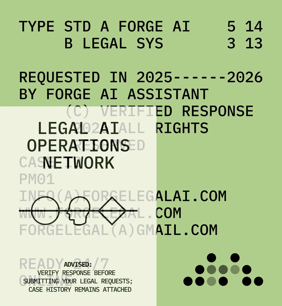
Green and cream split poster layering the spec text, LEGAL AI OPERATIONS NETWORK and the icon line.
fig 05 — PAST: an AI research lab Brand Design
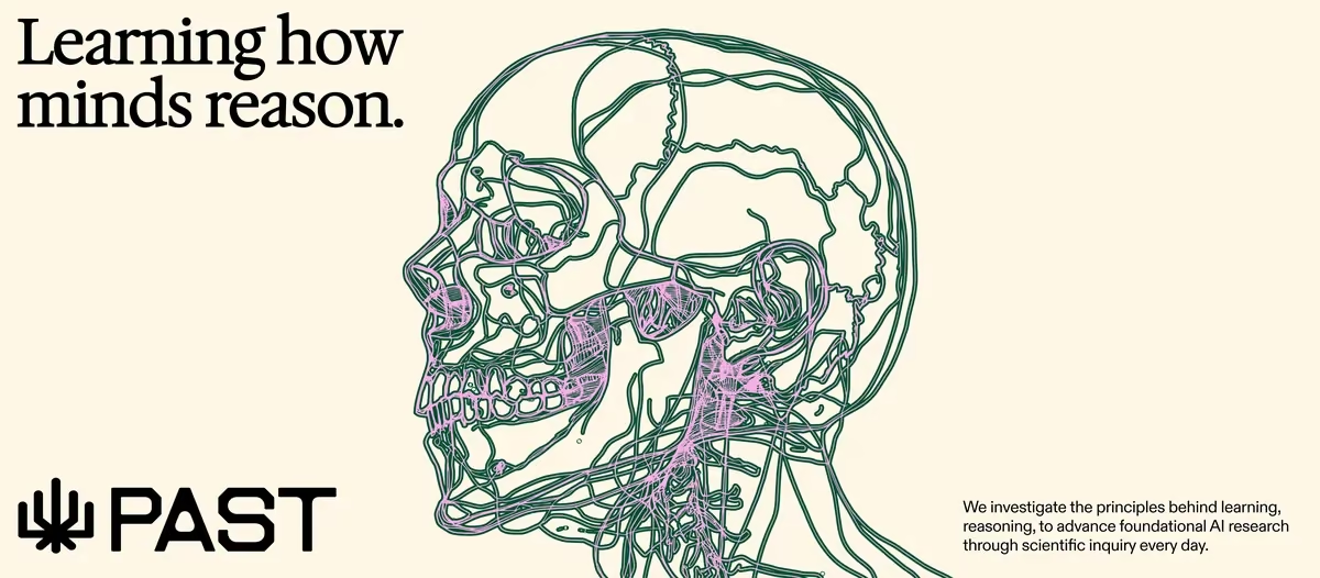
Learning how minds reason, beside a green and pink continuous-line drawing of a skull in profile, with the PAST logo.
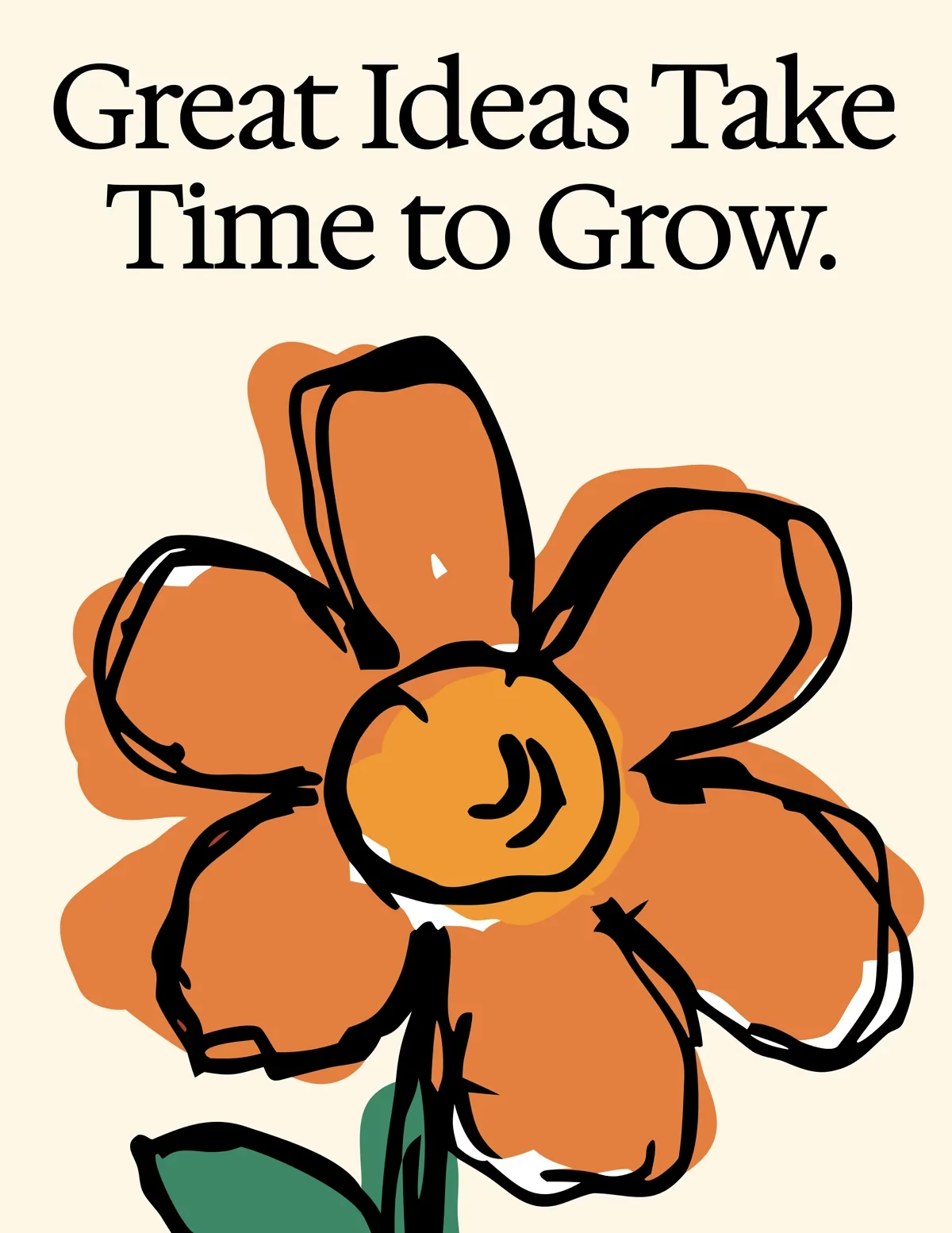
Great Ideas Take Time to Grow, above a hand-drawn orange flower with a yellow centre.
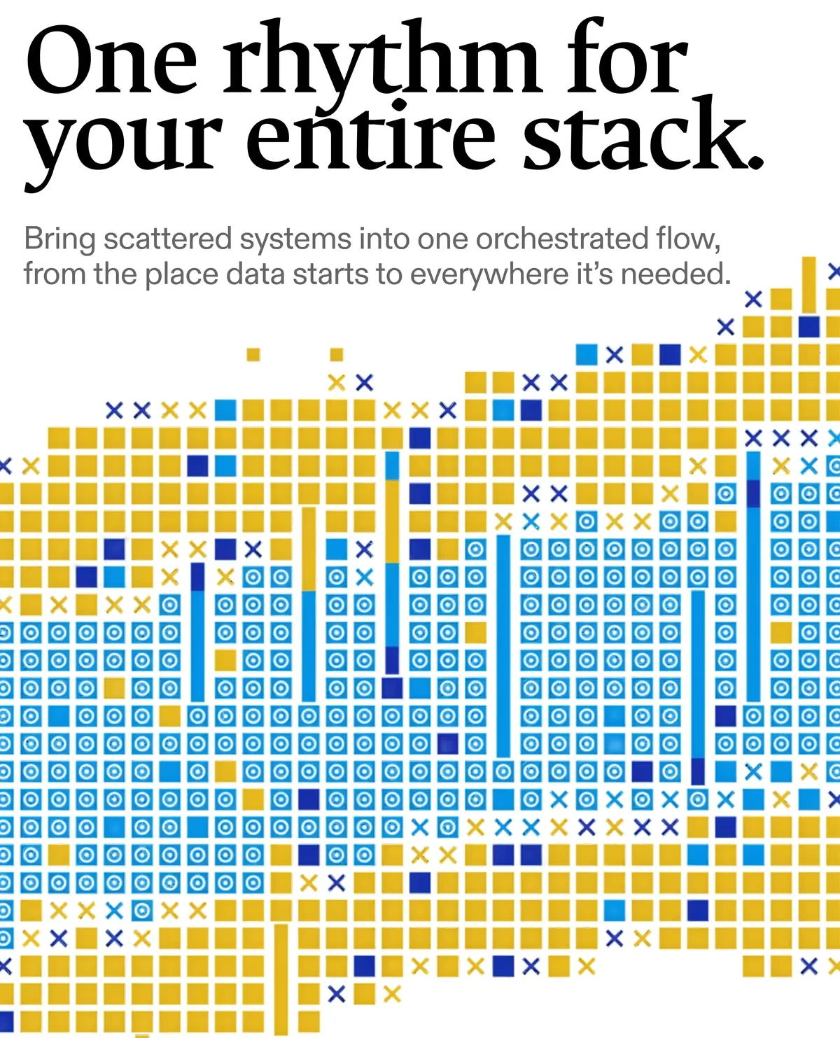
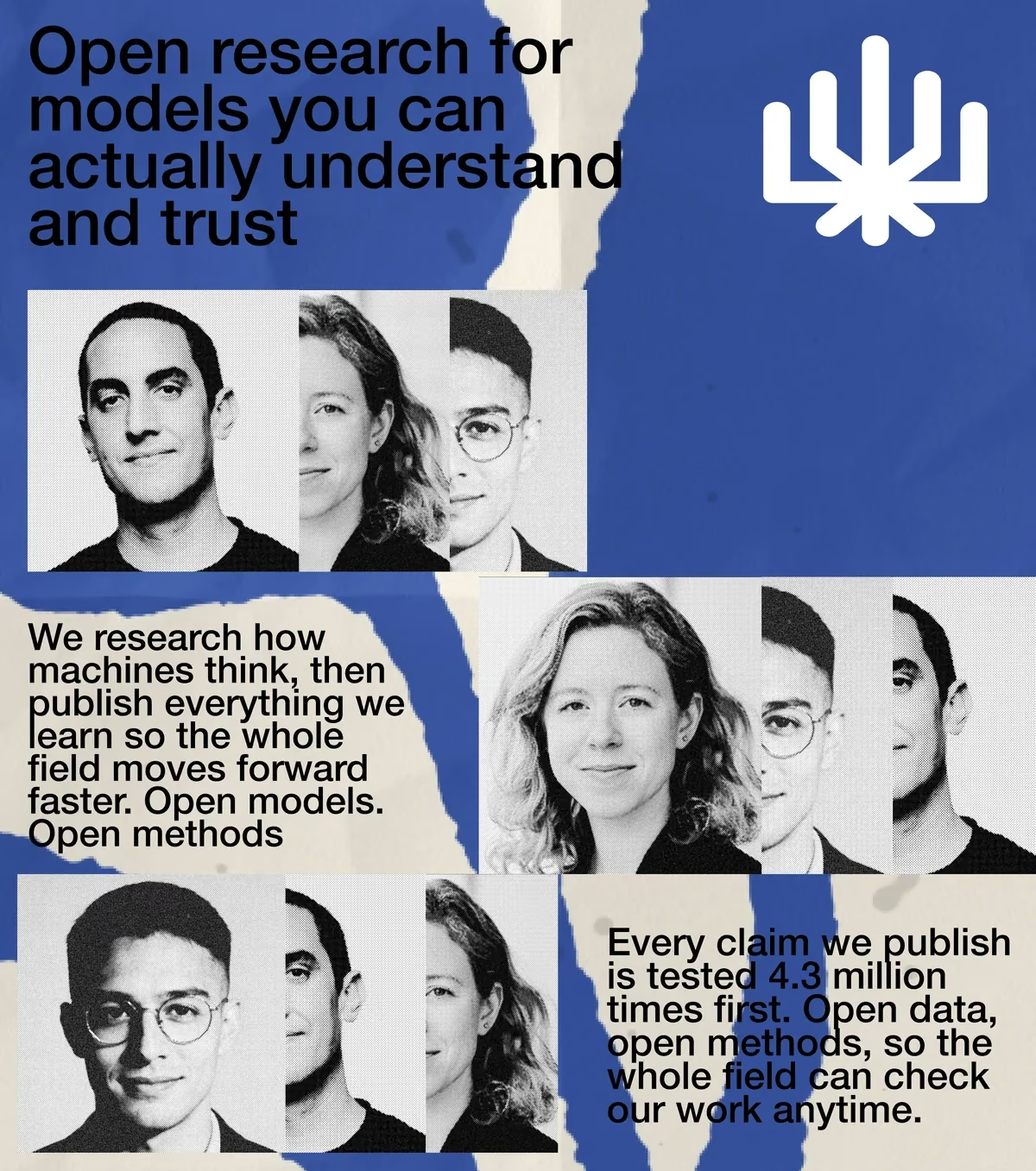
Torn-paper blue layout: Open research for models you can actually understand and trust, with halftone portraits of the team and the PAST mark.
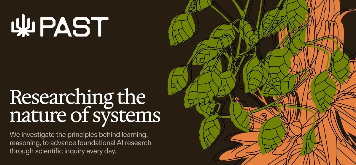
Dark brown banner: the PAST logo and Researching the nature of systems, beside a green and orange botanical line drawing.
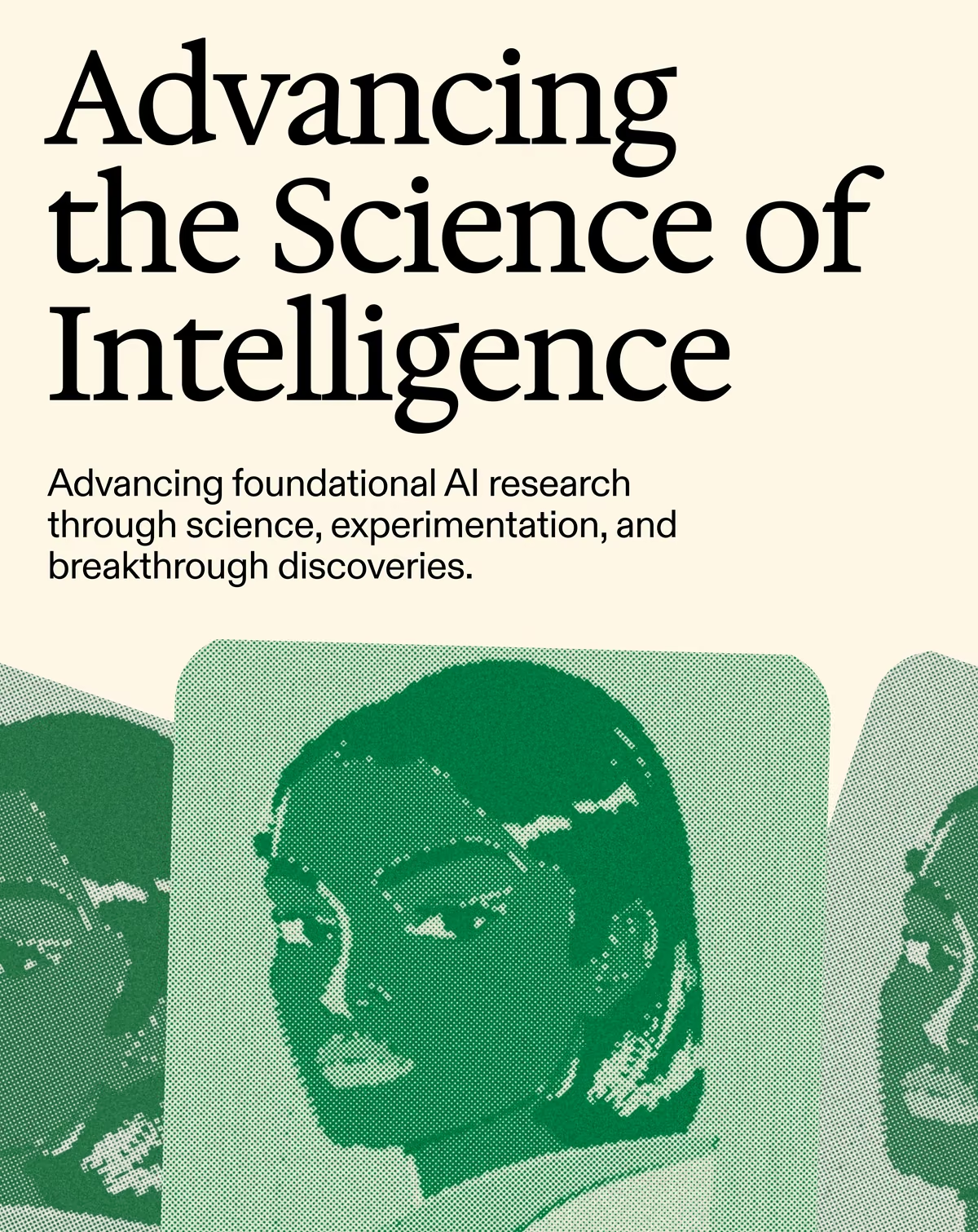
Advancing the Science of Intelligence, above green halftone portraits layered as overlapping cards.
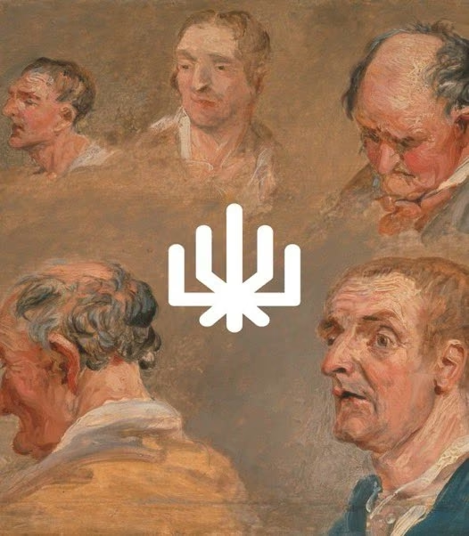
The white PAST mark centred over an old master oil study of five weathered faces.
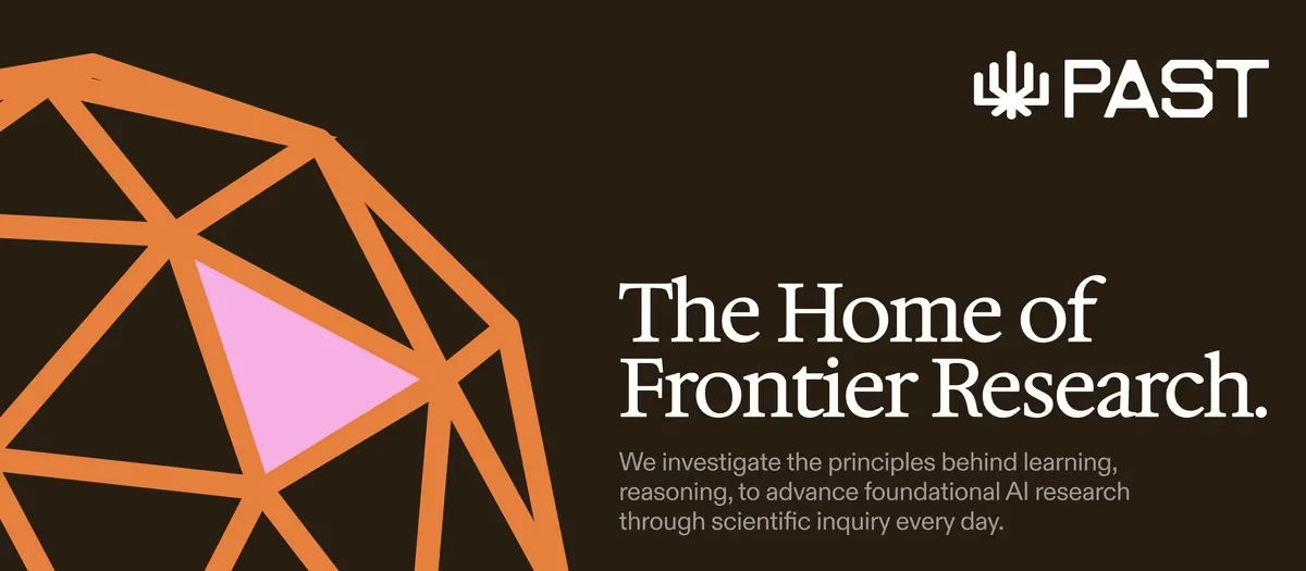
The Home of Frontier Research, beside an orange wireframe dome with one pink facet, on dark brown.
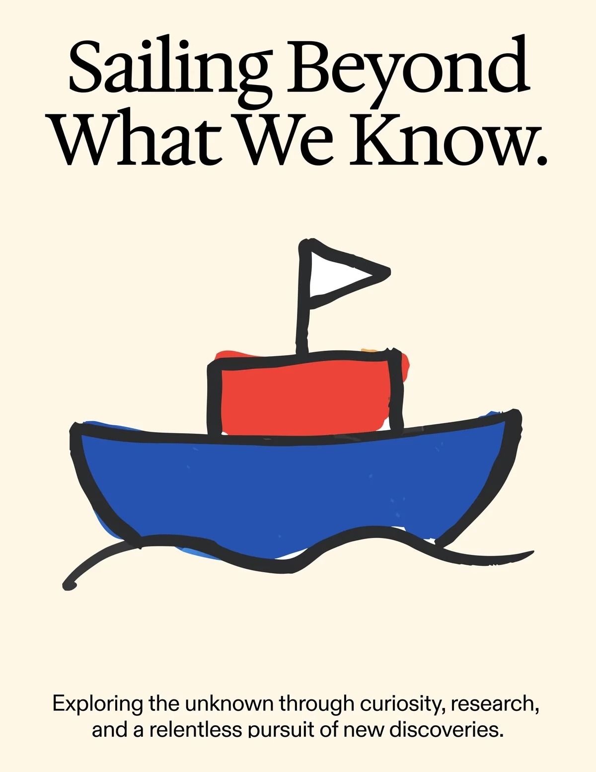
Sailing Beyond What We Know, above a hand-drawn red and blue boat with a white flag.
The PAST logo in black: the radiating mark beside the wordmark, on white.
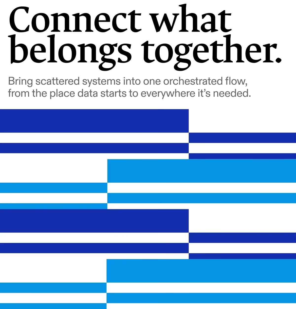
fig 06 — Stack: data orchestration for your models Brand Design
The Stack mark on its own: a pixelated blue tile with a yellow diagonal form at its centre, on warm grey.
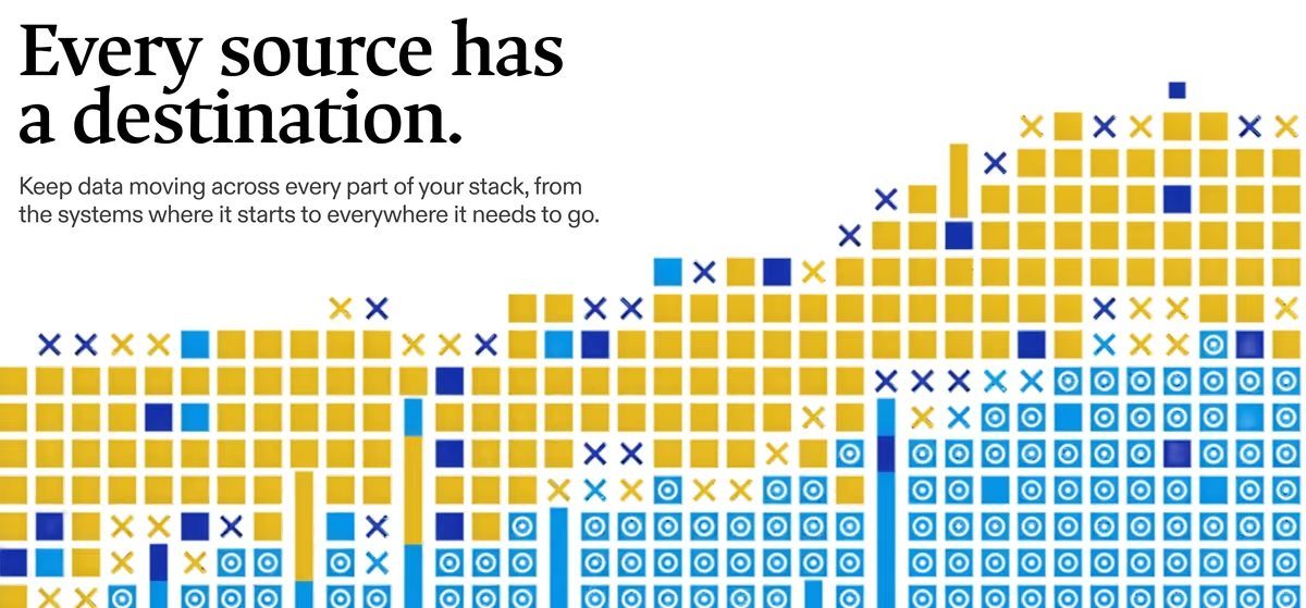
One rhythm for your entire stack, above a dense field of yellow and blue pixel glyphs rising like a waveform.
Connect what belongs together, above interlocking blue and white bars that read as data lanes.
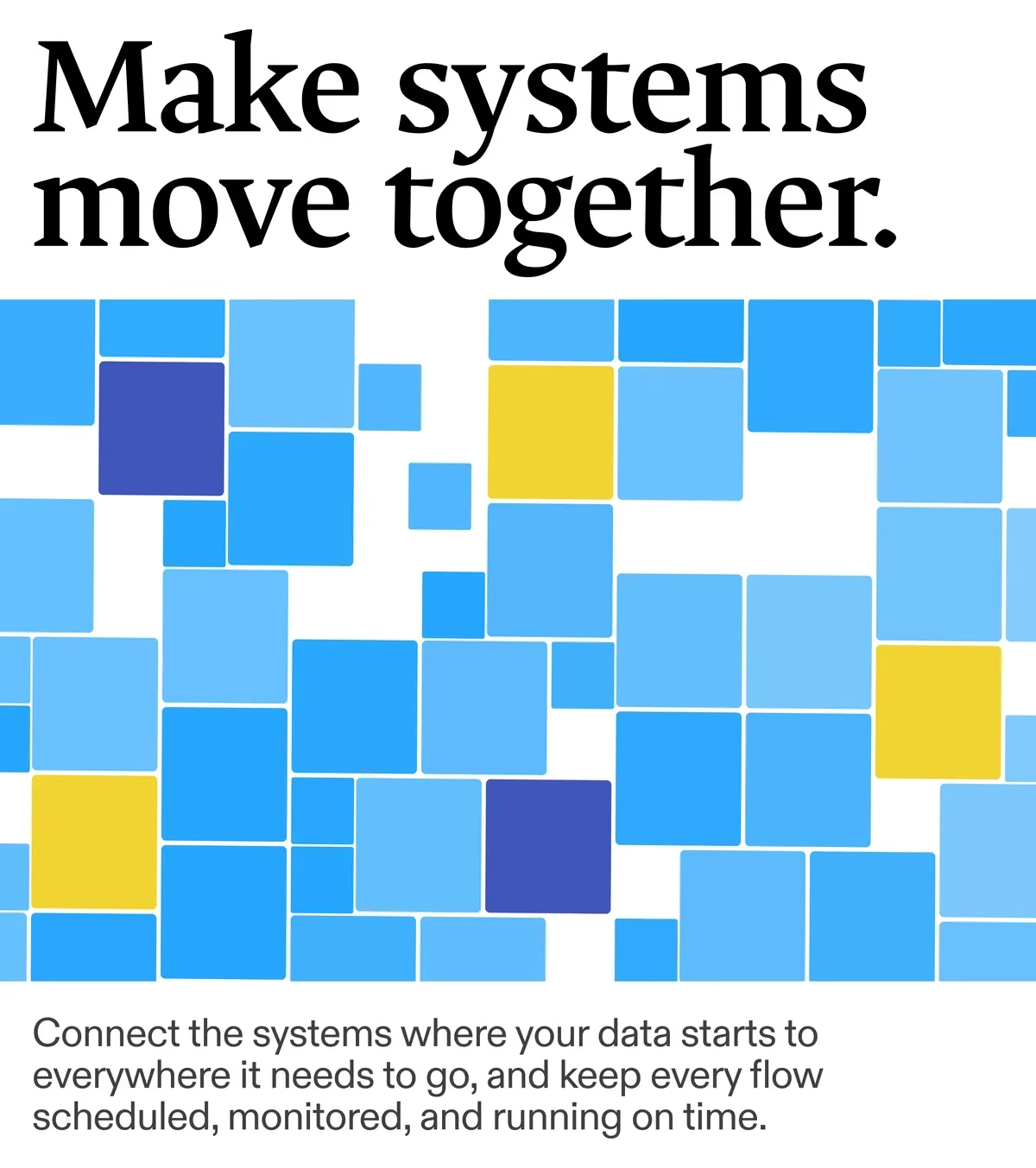
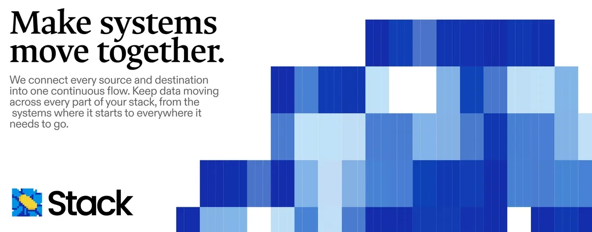
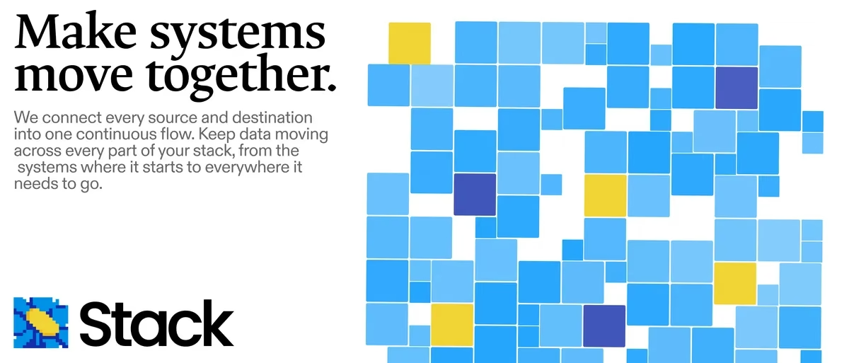
Make systems move together, beside a scattered mosaic of blue squares with yellow and indigo accents, with the Stack logo.
The full Stack logo: the pixelated blue and yellow mark beside the black wordmark.
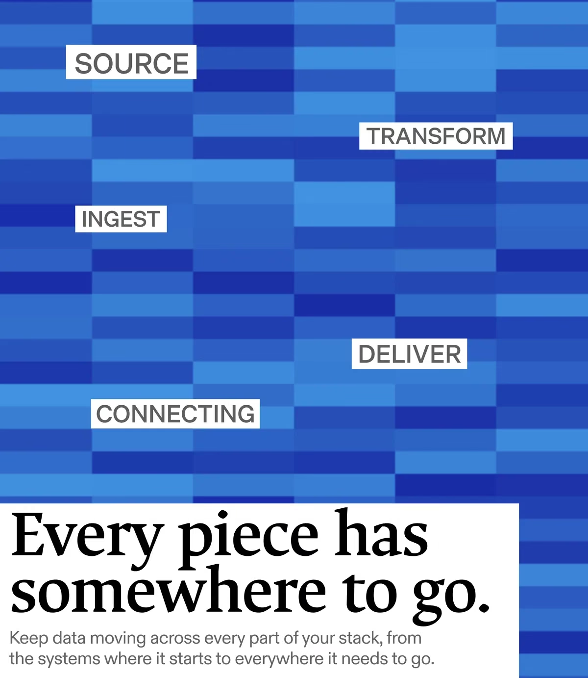
SOURCE, INGEST, TRANSFORM, CONNECTING and DELIVER labelled over a blue pixel grid, under the line Every piece has somewhere to go.
Make systems move together, above a loose grid of blue tiles with yellow and indigo accents.
Every source has a destination, beside a dense rising field of yellow and blue pixel glyphs.
Wide banner: Make systems move together, with a stepped blue pixel landscape and the Stack logo.
fig 07 — Logofolio: recent logo work for startups Logo Design
A white radiating mark centred over an old master oil study of five weathered faces in warm earth tones.
The Mimo logo: an orange bird mark beside the black wordmark, on cream.
The Lucid AI logo: a green pixelated four-point star beside the black wordmark.
The Gale logo: a blue nested-square maze mark beside a serif wordmark.
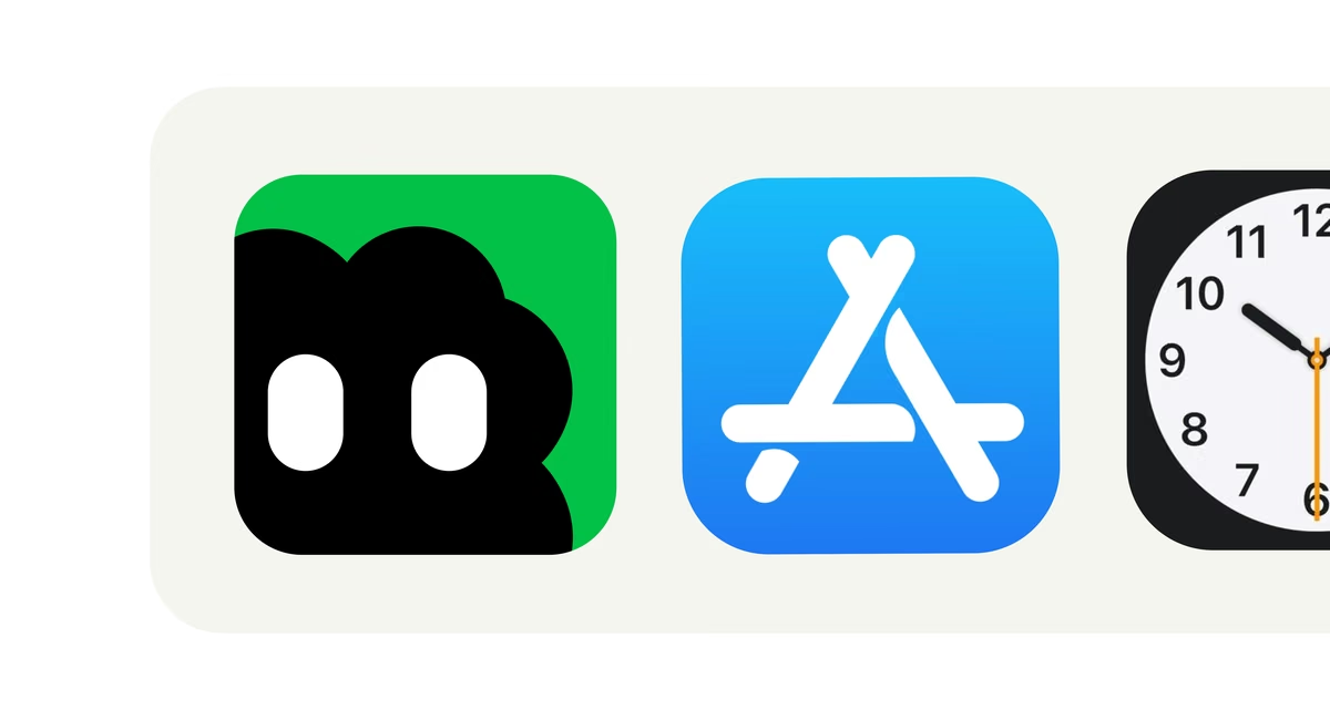
The Bloop logo: a magenta cloud-shaped character with two eyes, beside the black wordmark, on cream.
The Stack logo: a pixelated blue tile with a yellow form at its centre, beside the black wordmark.
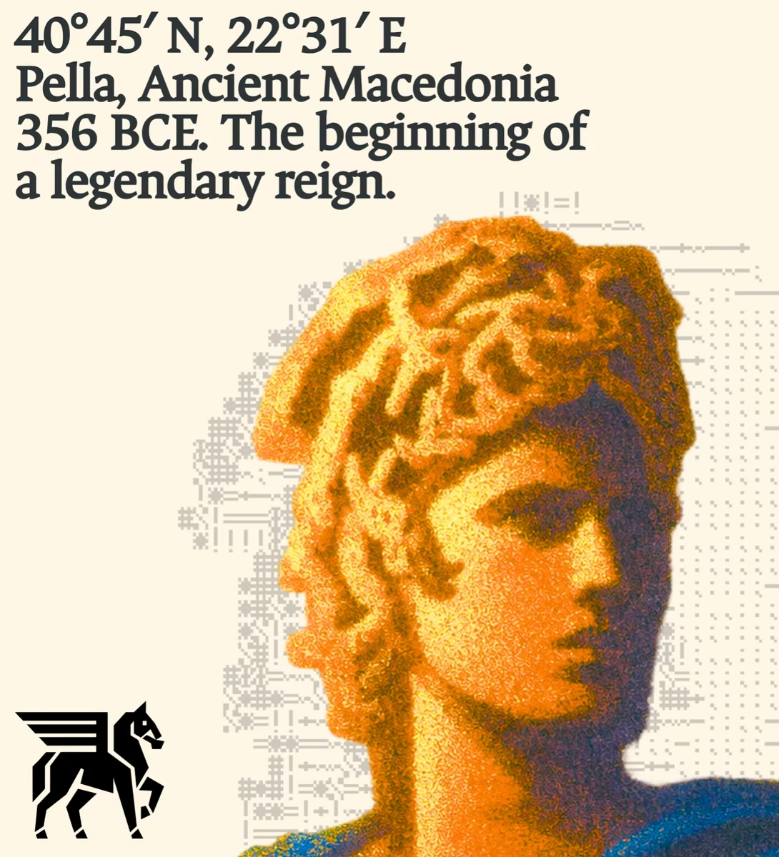
A white winged-horse mark over a grainy red, orange and yellow duotone of a statue in shadow.
The Basis logo: a black cross-shaped mark with a soft diamond cut from its centre, beside the wordmark.
The Bictor logo in blue: a hexagonal snowflake mark beside the wordmark.
A white interlocking orbital mark over a grainy duotone silhouette of a head in profile.
fig 08 — Bloop: a personal ai assistant Brand Design
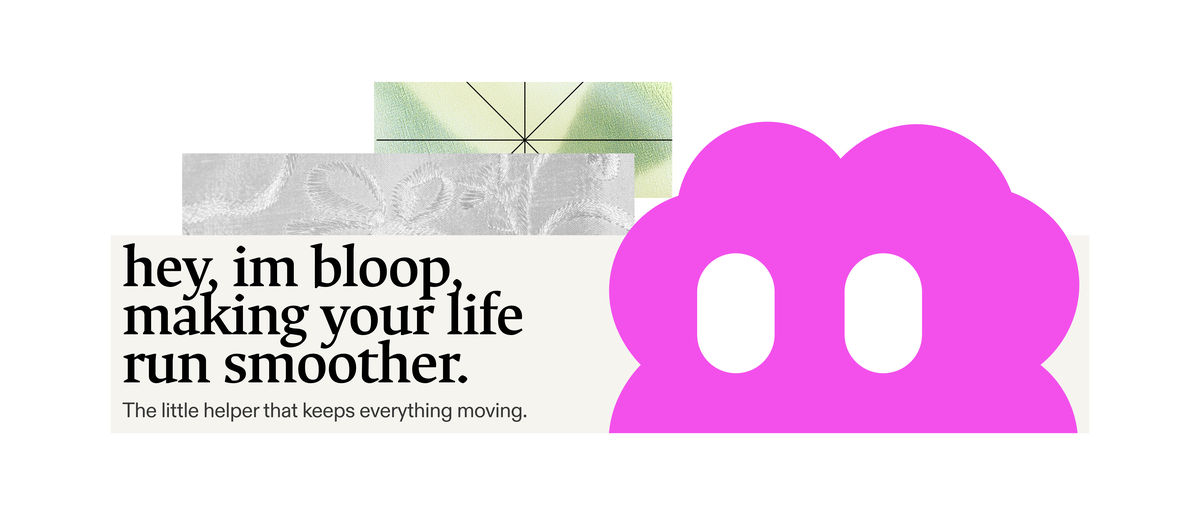
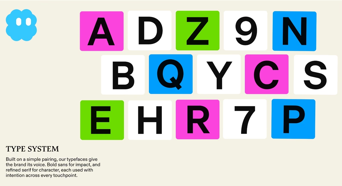
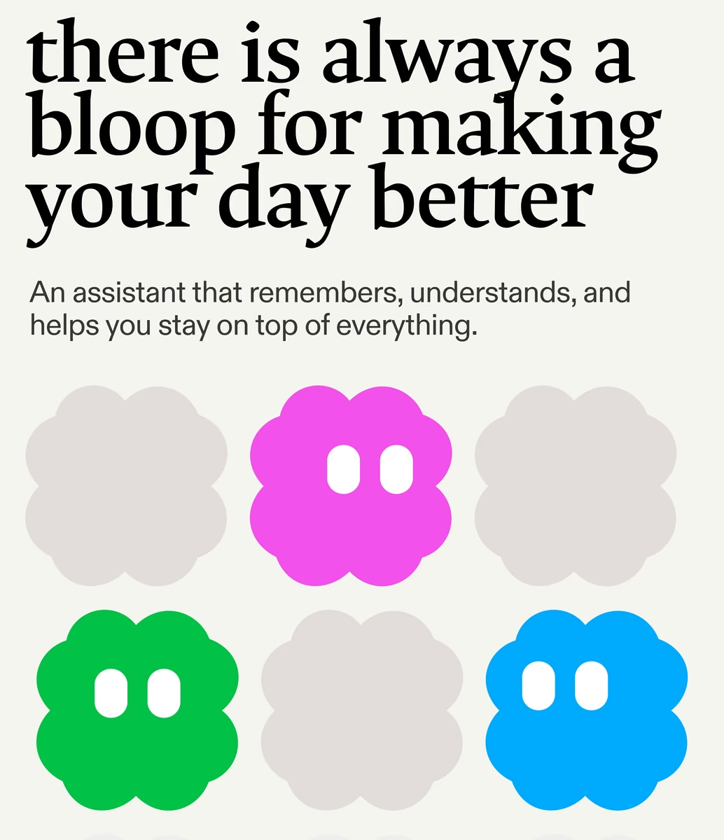
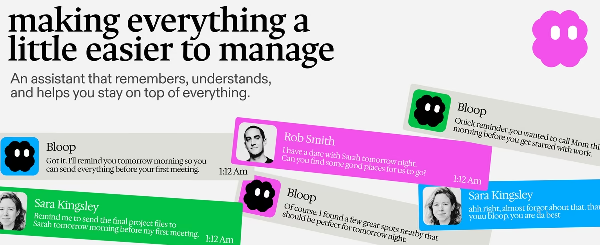
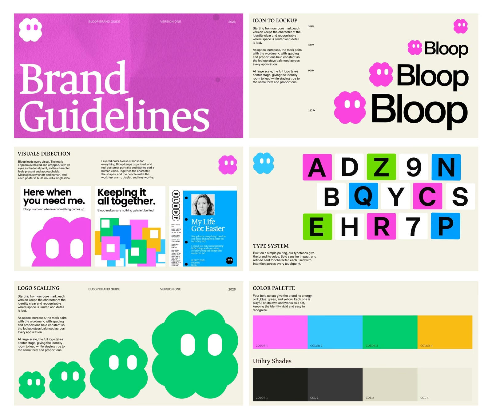
hey, im bloop, making your life run smoother — beside the magenta two-eyed Bloop character, with green and silver fabric swatches above.
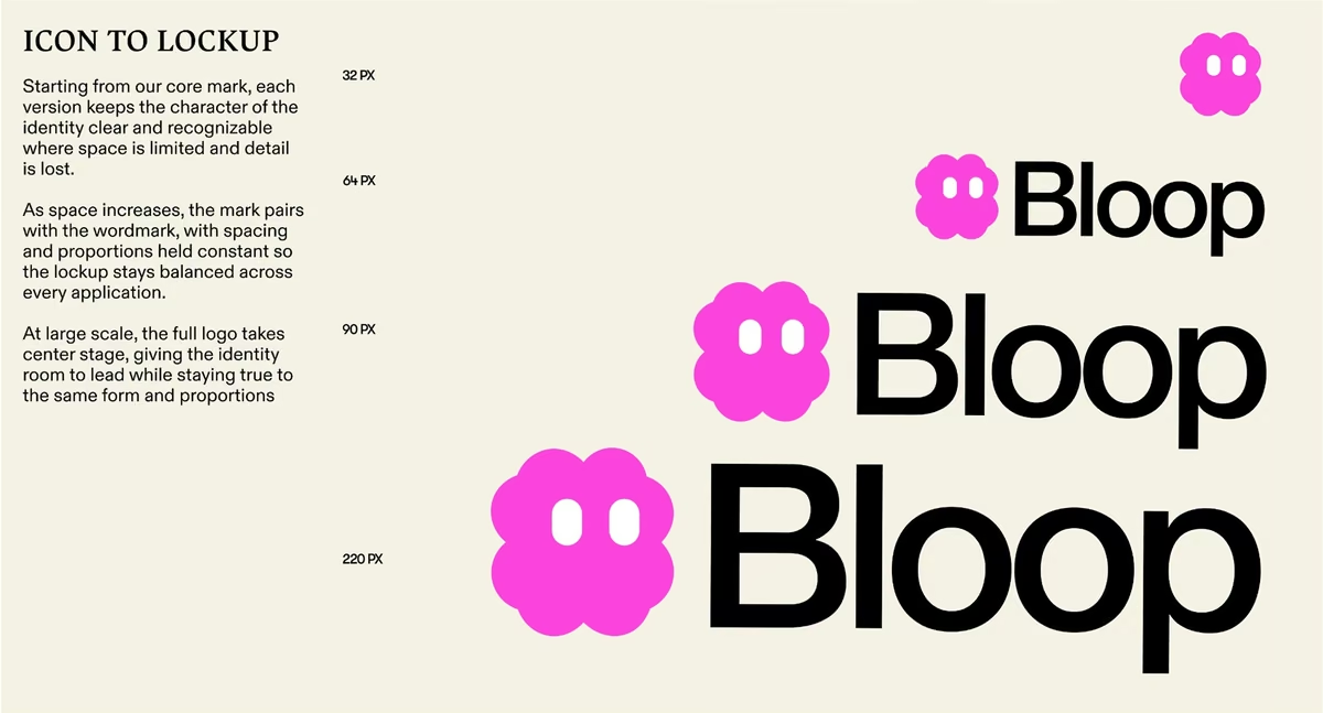
Bloop
Bloop
Bloop
Bloop
Bloop
Bloop
Bloop
Bloop brand guidelines
fig 09 — Epos: an ai based on history Brand Design
Project Nine
Project Nine
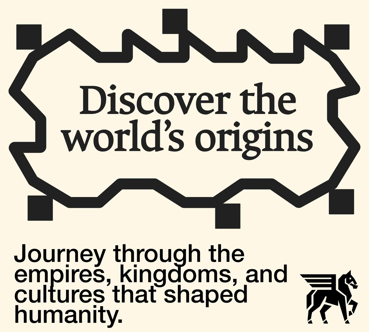
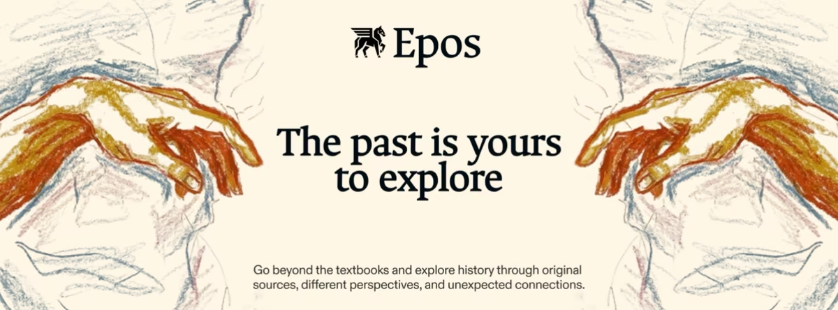
Epos
Epos
Epos
Epos
Epos
how i work

There are two ways to start. You can book a call and we talk it through, or we keep the whole thing async and work in writing. Async is not a lesser option. I have run plenty of projects that way and they came out well, and it saves time on both sides, so founders who keep it async get 12% off every package on my pricelist.

Once we agree on a package, I send two things. The first is a brief: 15 to 20 questions about your business, what you actually need, and how you want the work to look and feel. The second is a contract covering what you get, what it costs and how payment works, so nothing is vague once we are underway.

When the brief comes back, I spend a day or two on research: your market, your competitors, and where there is room for you to look different. Then you get two or three moodboards. You pick the one that feels right, and I build directions out of it. Once you lock a direction, the rest of the timeline goes into building the brand properly.

Payment is split down the middle. Half up front to start, half once the work is finished. No refunds, as every project takes real time and hard work.

Handover runs in this order:

  1. I show you the finished work,
  2. you send the second half of the payment,
  3. you get everything: design files, visuals and full ownership,
  4. plus an interactive guidelines page, so your team can copy a colour or grab an SVG without digging through Figma or a PDF.
pricing

These are the packages we’re offering this month, and the response has been crazy so far. We’ll be returning to our regular pricing soon, which means prices will be going up by 3–4x. Grab your spot while you can.

Logo Sprint

For a new business that just needs a logo to start with. No full brand system, no guidelines. Just a logo you can use everywhere.

$8607 days delivery
Choose this plan
  • 3 logo concepts
  • Unlimited revisions
  • Favicon
  • Typography system
  • Colour palette

Full Brand Design

For a business that needs the whole thing built, not just a logo and a guide. Everything from the Mini Brand Sprint, plus posters, brand assets and a visual system to carry it across everything you make.

$4,0003 weeks delivery
Choose this plan
  • 6 logo concepts
  • Unlimited revisions
  • Favicon
  • Typography system
  • Colour palette
  • Interactive brand guidelines
  • Posters
  • Brand assets
  • Visual system

Someone is putting up a building down here. Give him a hand.